How is retro design defined?
At its core, retro design is new design that utilises trends and characteristics of the past. It could be inspired by features of an older design style or it could be an updated version of it.
Images from previous generations are brought back in a new creation that adopts old styles and presents them in a modern way.
When did it start?
Different types of retro designs have been popular since the 1940s, but it was in the early 70s when the term ‘retro’ was coined.
It wasn’t just graphic design that adopted the retro style. It was also fashion, art, film, gaming and music. Over the years, retro design has continued to change and evolve.
Table of contents:
Why is retro design so appealing?
On the surface, it’s easy to put a yearning for times gone by down to pure nostalgia.
However, there is more to it than that, it’s also an appreciation for the innate charm of these design styles. Their re-emergence is down to strong design characteristics that have the potential to work in any era, and not only brought about by attachment from fond memories.
Logically speaking, you would think that retro design wouldn’t be so appealing. Old trends are categorised as such for a reason, but yet they return to fashion on a regular basis.
Retro design in the world around us
The recurrence of retro styles in design has seeped into the world around us. New products that embrace old design ideas are a prime example of this.
We see product packaging hark back to years gone by in an attempt to create a wholesome aesthetic and product design that utilises elements of previous iterations in newer releases.
Sports teams often use attire from the 70s, 80s and 90s as inspiration for their modern day kits.
Examples of retro design
The following design templates are some examples of retro design that you can personalise with Design Wizard.

Pixelated Design
Pixelated designs bring us back to the retro arcade games of the 80s. As the graphics of games improved, pixels have become smaller and smaller. In many modern games, you will never see them.
However, older gamers will remember the large squares that stood out on the screen. None more so than those of the pixelated heart, which represents the lives that your character has left.
Designs that are intentionally pixelated have become popular and this birthday template shows how it can be used to create a charming design.

Flash Sale Designs
The jagged text box and lightning icons in this design emphasise the fast paced nature of a flash sale. The style is reminiscent of 80s and 90s flash sale designs that used bright colours and strong contrasts.
The vivid flash sale posters were made to stand out and grab a customer’s attention. Nothing has changed in business and companies still need to find ways of standing out among the crowd.
The loud and engaging presentation of these designs ensure that they remain a go-to choice when advertising a flash sale.
Neon Colour Schemes
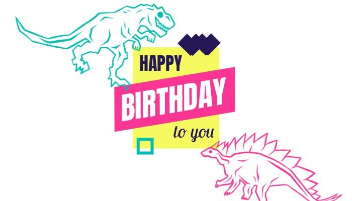
Neon colour schemes were all the rage in the 80s and in recent years they have staged a return. Such is the prominence of bright yellows, pinks, oranges and greens on social media, neon can also be seen as a symbol of modernism.
They tend to divide opinion among designers. Considered garish and unappealing by some, neon colours are adored by others.
In this birthday card design, the outlines of the dinosaurs are made evidently more noticeable by the use of vivid colours.

Pink and Red Combinations
Sometimes considered to be an incompatible combination, red and pink can form a superb design under the right circumstances.
Here we see a hot pink and vibrant red used to make this pineapple-themed social media post stand out. They are a monochromatic color scheme, making them very close to each other on the colour spectrum.
It’s an intense look that might be too much for some, but nowadays it’s all about being as bold and bright as you can. So this colour scheme is very effective for those purposes.

Memphis Style
Memphis design has its origins in the 80s and it doesn’t shy away from the less-formal side of design. Memphis used elements of design that were unpopular and made them fashionable, and that popularity lives on in modern times.
Interior design is where memphis started, but it looks just as good in graphic design. Memphis is known for its combinations of vibrant colours and funky shapes.
This turquoise invitation design is an eye-catching template that is perfect for making a stand out invitation for your party.
An 80s Throwback
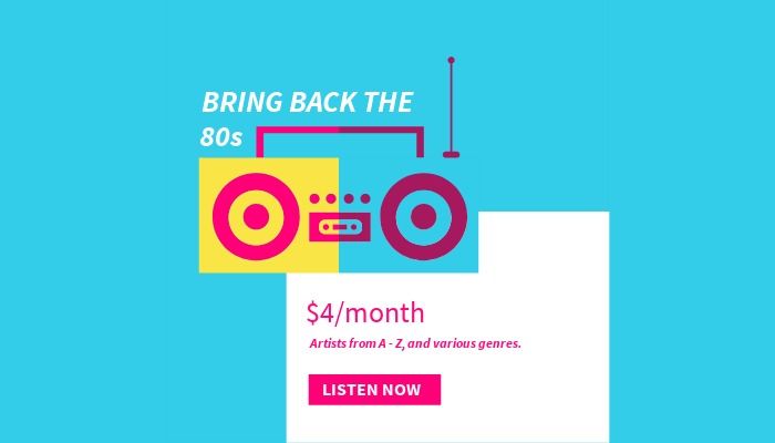
Fashion and graphic design can often go hand in hand, and the recent return to popularity of 80s style clothing has coincided with a return for 80s style design.
Many of today’s designers were inspired by 80s design trends when they were growing up and it’s evident that it has come full circle and they are now producing similar retro content.
80s designs like this music-themed social media templates would look great on platforms like Facebook, Instagram, Twitter and Pinterest.
Gatsby Theme
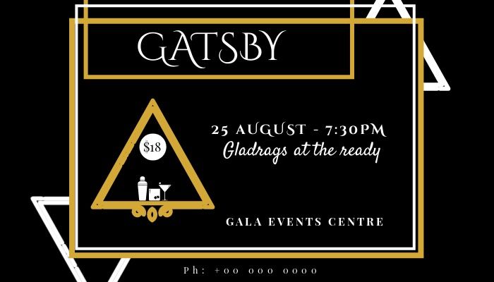
The glitz and glamour of Gatsby-style designs will continue to look as good today as they did 100 years ago.
Gold, silver, black and white are prominent colours in these designs and they can be used for making invitations for a variety of events.
Inspired by F. Scott Fitzgerald’s 1925 novel ‘The Great Gatsby’, this type of design shows no signs of going out of fashion any time soon.

Retrowave
Retrowave is a form of electronic music that takes inspiration from 80s games and movies. This design features the classic retrowave pink/purple gradient and is adorned by a stylised video cassette.
Video cassettes (like vinyls) have become a symbol of all things retro, which makes it a fitting inclusion on this design.
This template would be great for creating a custom YouTube profile picture for a retro-inspired film, gaming or music YouTube channel.
Polka Dots
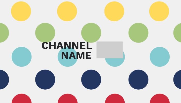
The polka dot pattern, a collection of circles of the same size, can be traced back all the way to the 19th century.
While it’s more common in the world of fashion than that of graphic design, the pattern continues to pop up in the work of many designers.
It’s generally seen as a fun and playful pattern, which is why it’s often used in designs that have an upbeat tone about them. This YouTube channel art design uses bright and engaging polka dots to attract subscribers.

Retro Album Art
Album art is always changing and evolving, but since new bands more often than not take inspiration from previous generations, retro album design is always in vogue.
Retro album design spans from the zombified illustrations on Iron Maiden CDs to the eye-catching pink on some of Duran Duran’s covers. So there is an almost endless pool of styles to take inspiration from.
This CD cover template uses a triangle pattern and vivid colours that would look at home in the 80s. It’s given a modern interpretation in this design that’s perfect for a dance-themed album.
Retro design is here to stay
The warm, familiar feeling that retro design gives us when we see it will always be a powerful one. That’s why it will remain an important part of graphic design for the foreseeable future.
Designers will always have a tendency to look to their idols and the past for inspiration. This ensures that retro design will continue to be reflected in their work.
You can customise any of the templates featured in this blog post in Design Wizard and create your very own vintage design. Once you’re done, show us what you’ve created by tweeting @getdesignwizard.

Michael Cole
Michael Cole is a professional content writer. He has completed a BA in English and History and an MA in Journalism. Michael has extensive experience writing for both print and web and can turn his hand to any subject. His favourite one is free graphic design software. Especially he likes Background Remover by Design Wizard.


