
Summer Colour Palettes and Everything About Them
A colour palette is a specific set of colours chosen for a design and how they interact with one another. Monochromatic, similar, complementary, or triadic colour palettes are all possible. It can help a brand’s visual identity, elicit a specific mood or emotion, or even convey a story.
In addition to traditional colour palettes, seasonal colour theory and palettes have grown in popularity in recent years. Seasonal colour palettes use colours that mirror the changing seasons, such as autumnal hues for autumn or pastel tints for Spring. Designers can employ seasonal colour palettes to associate their designs with the present mood and elicit seasonal emotions in their audience. Understanding seasonal colour theory and palettes can assist a designer in producing contemporary and pertinent designs that embody the soul of each season.

Table of contents:
- ● Summer Colour Palettes and Everything About Them
- ● Seasonal Colour Theory
- ● The Origin of Colour Theory
- ● Seasonal Colour Theory & Their Personalities
- ● Summer Colour Palette
- ● What Emotions Does a Summer Colour Palette Evoke
- ● Different Types of Summer Colour Palettes
- ● How to Include Summer Colour Palette in Graphic Design
- ● Examples of Summer Colour Palettes in Graphic Design
- ● Embrace the Warmth and Vibrancy of Summer Colours
Seasonal Colour Theory
Colour psychology is based on the notion that each colour has a special meaning. Colours can be utilized in marketing to elicit a specific sentiment toward a brand or product.
The same colour theory applies to the seasons of the year, as well as using personalities associated with them to create brands. Each season has its own set of colours that correspond to the season’s characteristics. And that personality can be used to style anything from a brand’s tone of voice to its fonts and photography style. All of the brand’s various aspects are much more unified, allowing the business to connect honestly with its target clients/customers.
The Origin of Colour Theory
The origins of colour theory date back to Johann Wolfgang von Goethe, a German philosopher who established the link between colours. To educate colour usage, painter Johannes Itten produced four colour palettes for the four seasons in the early 1900s. Following this, a lady named Suzanne Caygill combined Itten’s seasonal theory with Goethe’s colour psychology to develop the thesis that people’s natural colouring contains information about their personality and style. Carole Jackson, a psychologist, modified Caygill’s hypothesis in the 1980s, limiting it to one personality every colour season. Her hypothesis assisted individuals in shopping for clothes, accessories, and makeup by judging if they were warm or cool, light or dark.

Seasonal Colour Theory & Their Personalities
Let us understand seasonal colour theory with an insight into the seasonal personalities.
Spring
Spring is full of vitality as everything begins to grow. The Spring personality is upbeat and enjoyable, gregarious and creative, and energetic and cheerful. Warm, light, and bright colours to depict this include spring greens and daffodils.

Summer
Summer is lazier and hazier than Spring. Summer personalities are efficient and structured, logical and dependable, and they appreciate detail, quality, and flair. Roses and lavender are two colours that reflect this. They are cool, gentle, and understated.

Autumn
Autumn is livelier than Summer because the harvest is plentiful, and the leaves begin to change colour. Autumn is self-sufficient and real, passionate and just, friendly and loyal. Warm, deeper, and slightly muted colours reminiscent of autumn foliage!

Winter
Winter is a season of beautiful snow and blue skies, with darker days in between. Winter is ambitious but grounded, practical and focused while also dramatic and exciting. Colours that depict this are chilly, clear, and bright - monochrome with dazzling pops of colour, as well as icy pale tones.

Summer Colour Palette
Your brand colours play a powerful role in influencing and enhancing how your brand’s personality is perceived by your audience. Thus, when you choose a season to represent your brand, the colour psychology associated with that particular season works to your advantage.
So, if you have chosen summer as the season for your brand, the summer colour palette should resonate through all aspects of it. As one looks at a summer colour palette, it is sure to bring visuals of sandy beaches, water sports, amusement parks, ocean breeze, berry drinks, ice creams, and citrusy juices. And these summer colours associated can be used to boost your marketing game.
Summer colour palettes are often bright and brilliant, evoking feelings of warmth, energy, and enthusiasm. Summer palette colours that are popular include.
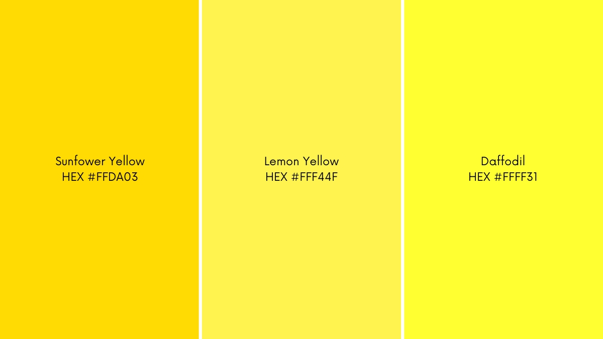
Yellow
Shades of yellow instantly give a summery feel. Sunflower yellow (hex code: #FFDA03) is a bright and warm yellow colour, while lemon yellow (hex code: #FFF44F) is a brilliant light-yellow tone. On the other hand, the daffodil (hex code: #E28D00) is a yellow-green flower that appears lively.
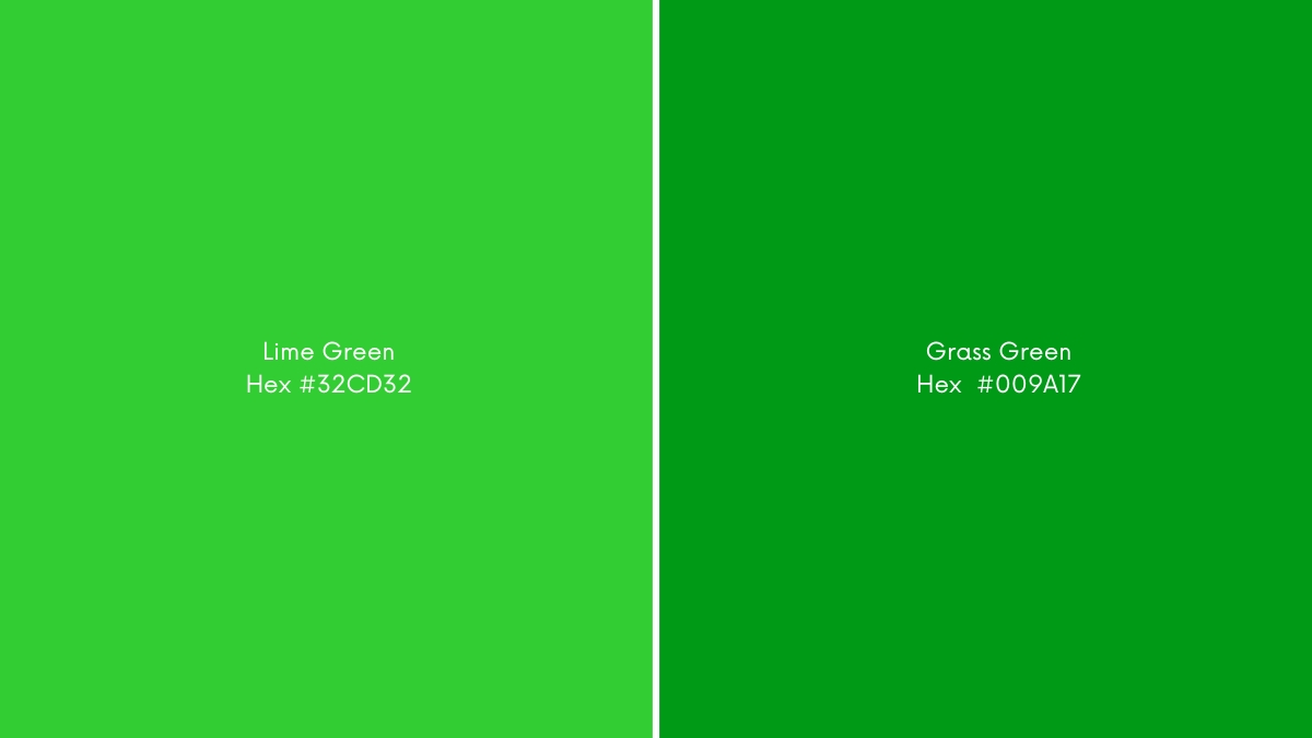
Green
Lush hues of green, including lime and grass, make for a bright yet calming choice. The hex code for Lime Green (hex code: #32CD32) and Grass Green including (hex codes: #009A17, #00A619, #008013, #09B051, and #59A608) are some of the most sought-after choices for summer. These shades of green signify health, vitality, nature, and balance in Western cultures.
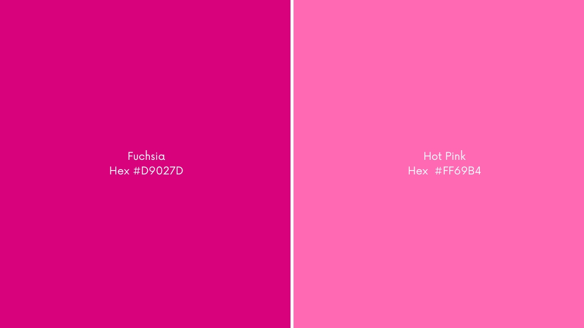
Pink
Bold pinks, such as Fuchsia and Hot Pink, instantly remind us of berries and candies that make summer all the more fun. Fuchsia (hex code: #D9027D) is reddish red or pink that is bold and vibrant. Hot Pink (hex code: #FF69B4) is a hot pink that is eye-catching and feminine. These hues represent confidence, love, passion, and playfulness.
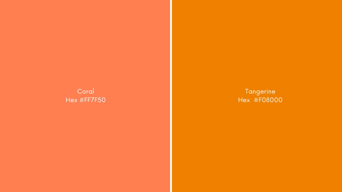
Orange
When it comes to orange, vibrant hues such as Tangerine and Coral are associated with energy and warmth. Tangerine (hex code: # F08000) is a vivid, saturated orange tone that cleaves very closely to its fruity namesake. Coral (hex code: FF7F50) is a warm, pinkish-orange colour that is often associated with the ocean. Fuchsia is a purplish red or purplish pink colour that symbolizes maturity, assurance, and self-confidence.
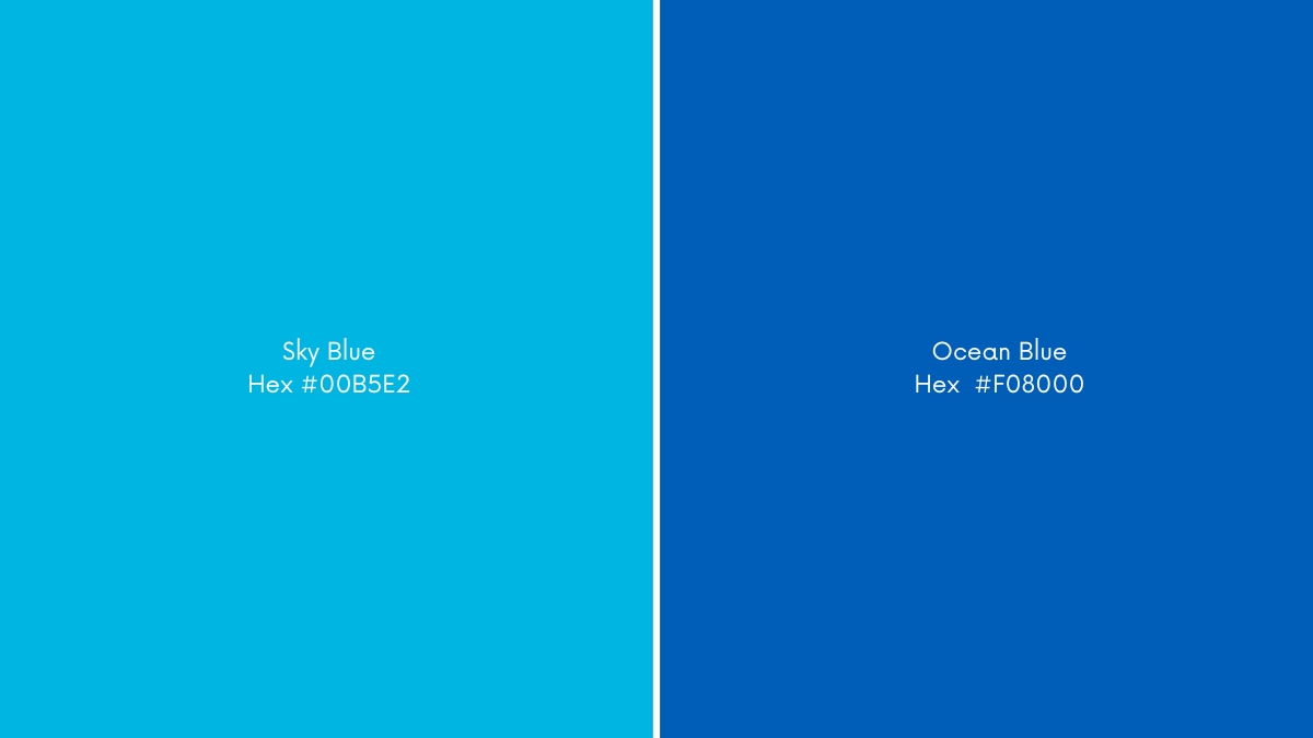
Blue
Sky blue (#00B5E2) and ocean blue (#005EB8) are both popular summer colours. Sky blue reflects the bright blue colour of a clear summer sky, while ocean blue represents the deep blue sea on a sunny day. These colours are commonly used in summer-themed branding, designs, and marketing materials, evoking a sense of relaxation, freshness, and coolness. Incorporating these colours in summer fashion, accessories, and home decor can also create a refreshing and calming atmosphere reminiscent of the summer season.
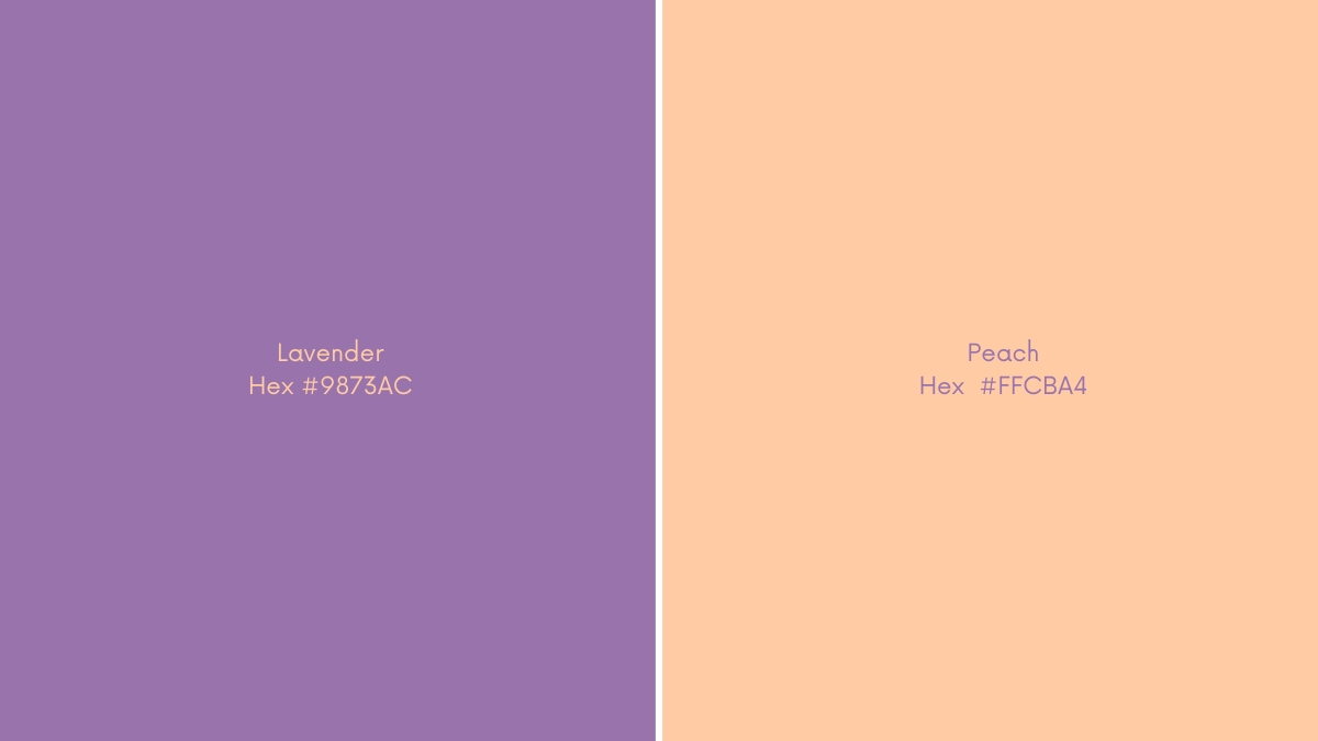
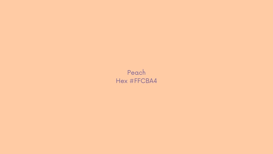
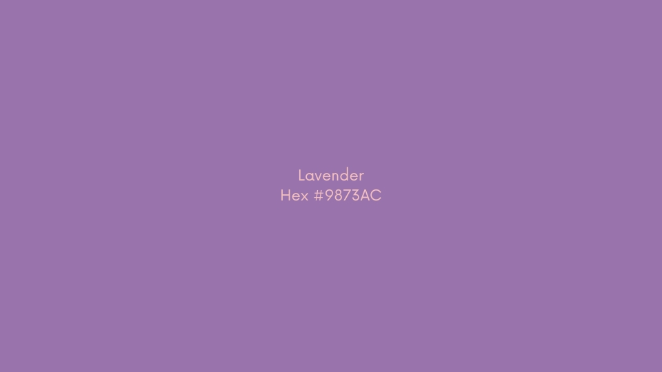
Pastels: Peach and Lavender
Soft pastels like peach (#FFCBA4) and lavender (#9873AC) are perfect for the summer season, lending a sense of delicate charm and gentle warmth to any design. Peach is a subtle, muted tone that evokes the warmth of the summer sun, while lavender is a calming and romantic hue that symbolizes the tranquillity of a summer breeze. These soft pastels can be used in branding, fashion, and interior design to create a serene and inviting ambience that captures the essence of the summer season.
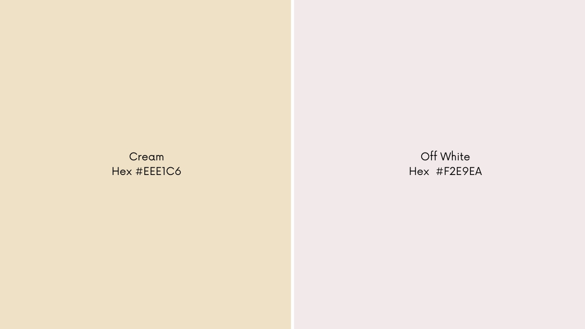
Whites and Creams
White (#F2E9EA) and cream (#EEE1C6) are classic summer colours that evoke feelings of freshness and lightness. White reflects the brightness and clarity of summer, while cream has a warm and earthy quality that is both soothing and sophisticated. These colours can be used in summer branding, fashion, and interior design to create a clean, elegant, and timeless look that exudes a sense of purity and simplicity. White and cream are sure to make any design feel airy, fresh, and inviting whether you use them in combination with other summer colours or alone, depending on the brand’s personality.
Summer is a season that is vibrant, energetic, and full of life, and the colours we choose to wear, decorate with, or market our products can reflect this exuberant vibe. A summer colour palette typically incorporates a range of warm and cool shades, from soft pastels that evoke a sense of calmness to bright and bold hues that exude confidence and playfulness. By using a mix of colours that complement and contrast with each other, we can create a visually striking and cohesive aesthetic that captures the essence of the summer season.
What Emotions Does a Summer Colour Palette Evoke
Summer colours are more than just a mix of bright and joyful hues; they express the atmosphere and flow of the season. Summer is a time of warmth, joy, and relaxation, and the colours we associate with it reflect that.
Designers frequently make use of summer colours in their work to produce visually appealing designs that generate feelings of happiness and delight. Summer colours are omnipresent in graphic design, from vacation brochures to festival posters. They can also be used to express a sense of playfulness and pleasure, making them ideal for children’s designs or promoting leisure activities such as picnics, beach visits, or camping trips.
Summer colours have a psychological influence on people in addition to their aesthetic attractiveness. They can elevate people’s spirits and make them feel happier and more positive. As a result, summer hues are employed in branding and marketing campaigns to assist in establishing a favourable image for a product or service.
So let us look at the top summer colours that you can incorporate into your designs if you want to go with a summer palette:
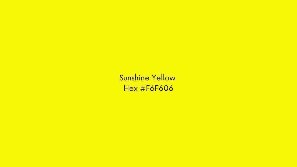
1. Sunshine Yellow (hex code: #f6f606)
This bright and joyful colour generates sentiments of happiness and joy and is reminiscent of the sun. It is ideal for designs that want to communicate a sense of optimism, playfulness, and excitement.
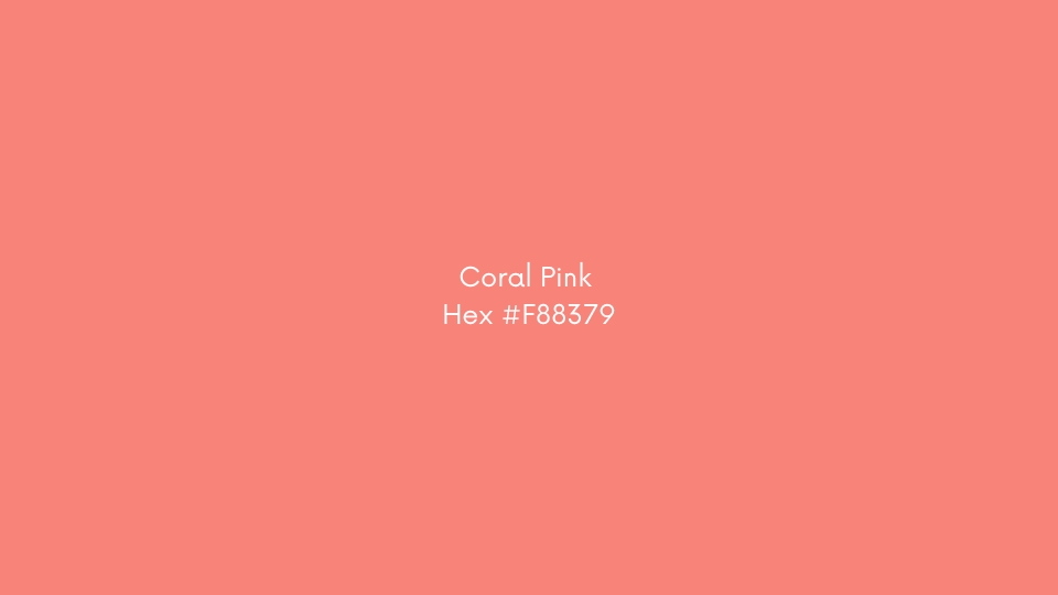
2. Coral Pink (hex code: #F88379)
This bright, colourful colour is ideal for summer designs since it is connected with tropical sunsets, beach umbrellas, and fruity drinks. It is a terrific colour to employ in designs that want to inspire sentiments of excitement, pleasure, and relaxation.
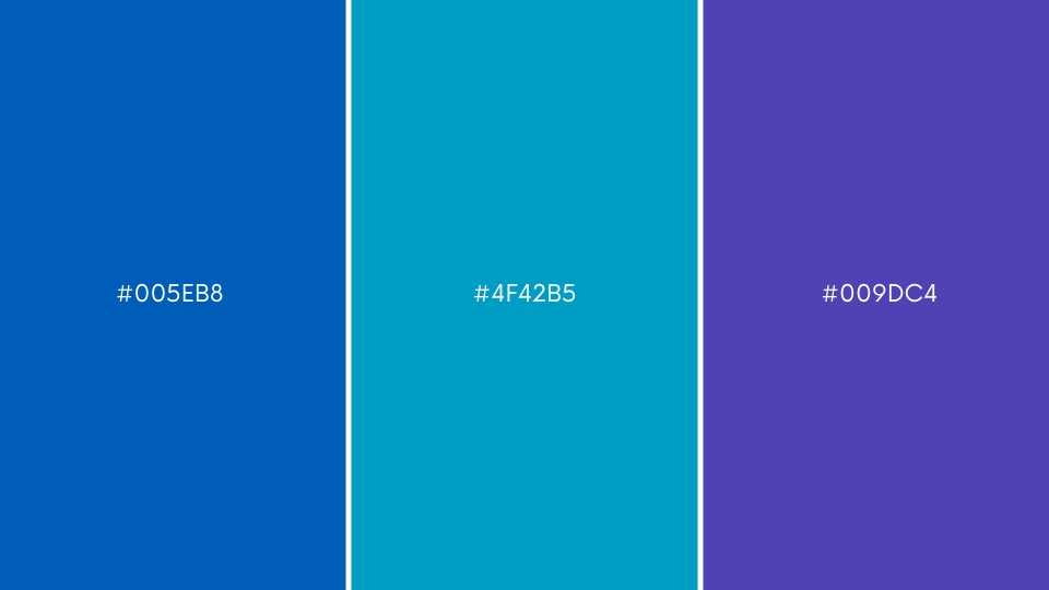
3. Ocean Blue (hex code: #005EB8, #4f42b5, and #009dc4)
This cold, refreshing colour is ideal for designs that create sentiments of serenity, quiet, and tranquillity. It is connected with brilliant blue skies, dazzling oceans, and the coolness of water.
4. Leafy Green (hex code: #30B700)
This lush, vivid hue is linked with nature’s growth and abundance during the summer season. It is ideal for designs that want to portray a sense of vibrancy, freshness, and regeneration.

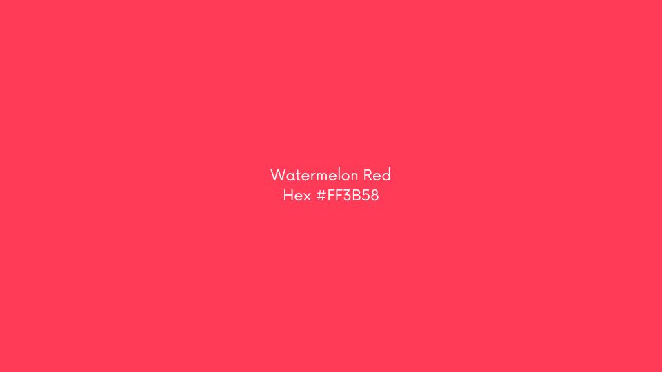
5. Watermelon Red (hex code: #FF3B58)
The richness and freshness of summer fruits are connected with this vibrant, juicy colour. It is ideal for designs that want to portray energy, vitality, and enthusiasm.
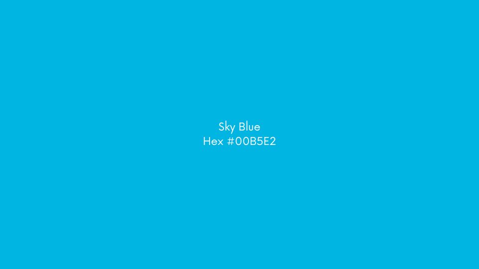
6. Sky Blue (hex code: #00B5E2)
This light, airy hue is reminiscent of a bright blue summer sky. It is ideal for designs that want to express a sense of openness, freedom, and expanse.
7. Peach (hex code: #FFCBA4)
This gentle, pastel colour is linked with summer sunsets’ warmth and sweetness. It is ideal for designs that want to portray tenderness, tranquillity, and comfort.
8. Lavender (hex code: #9873AC)
Summer evenings are associated with the gentleness and tranquillity of this delicate, mellow colour. It is ideal for designs that want to exude elegance, sophistication, and refinement.
Incorporating these summer colours into your designs can aid in the creation of a visually appealing and emotionally engaging brand experience that resonates with your target audience. Experiment with these colours to create graphics that capture the essence of summer and inspire your audience to feel joyous, carefree, and refreshed.
Different Types of Summer Colour Palettes
Indulge in the perfect summer colour combinations with our guide, crafted to quench your thirst for vibrant and lively hues. So, let us inspire you with the most enthralling shades of the season. Whether you are looking for playful pops of colour or calming pastels, we have you covered. Let us explore the endless possibilities of summer colour palettes together.
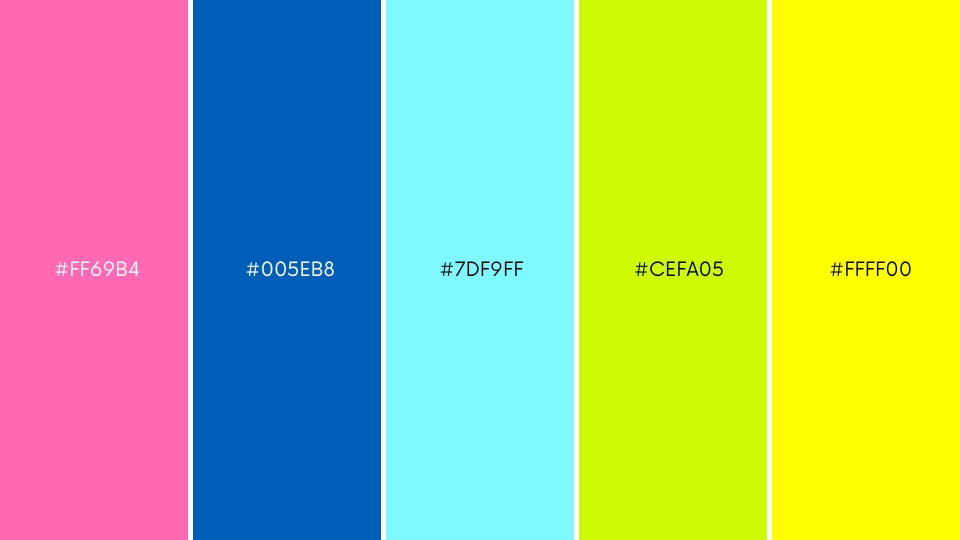
Tropical Palette
The dynamic tropical colour palette is all about bold and brilliant colours that reflect the tropical attitude. Colours in this palette include hot pink (#FF69B4), electric blue (#7DF9FF), bright yellow (#FFFF00), and lime green (#CEFA05). These colours go with each other beautifully, creating a joyful and vibrant atmosphere.
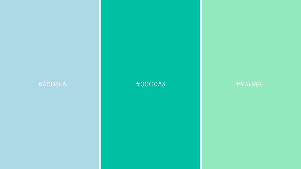
Beachy Palette
A beachy colour palette is often composed of muted, cold hues such as light blue (#ADD8E6), aqua (#00C0A3), and seafoam green (#93E9BE). These colours are frequently linked with the ocean, sand, and sky and can elicit feelings of relaxation and serenity.
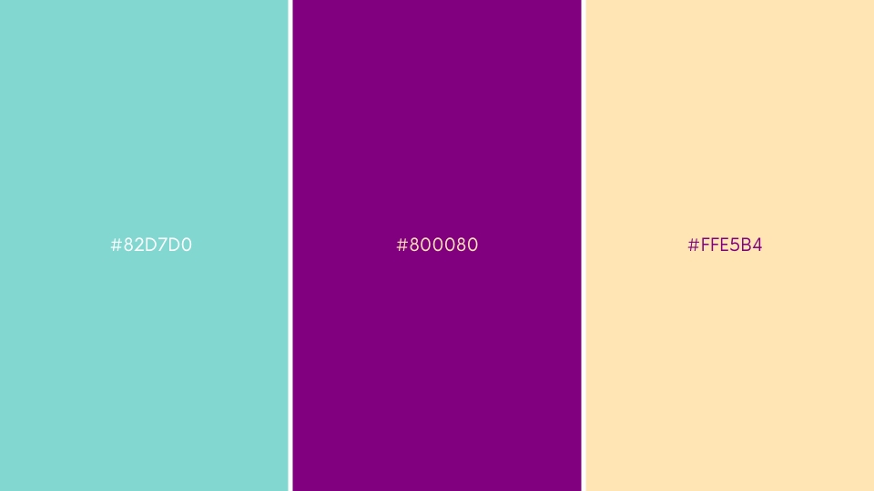
Sorbet Palette
Sorbet colours are delicate, pastel tones reminiscent of frozen desserts such as sorbet or ice cream. These colours, which include pink (#82D7D0), purple (#800080), and peach (#FFE5B4), are frequently employed to create a fun and whimsical style.
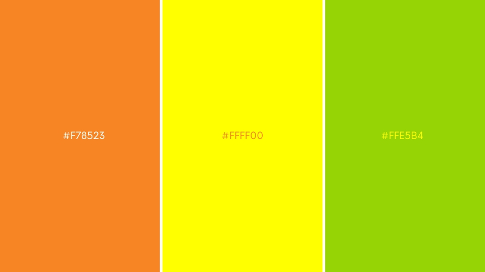
Citrus Palette
Citrus colours, which include orange (#F78523), yellow (#FFFF00), and green (#96D406), are frequently utilized to produce a bright and fresh look. These colours, which are reminiscent of citrus fruits such as lemons, limes, and oranges, can elicit sentiments of vitality and optimism.
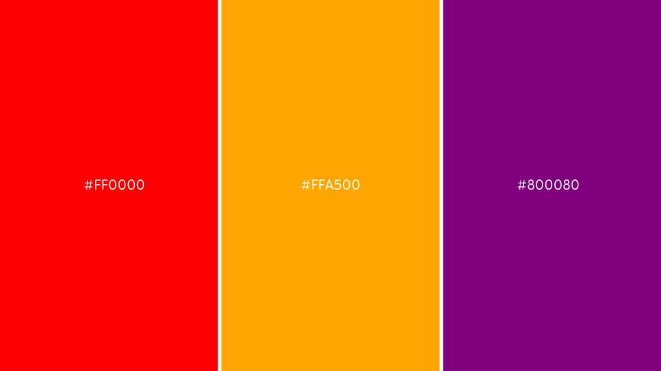
Sunset Palette
Warm, rich tones like red (#FF0000), orange (#FFA500), and purple (#800080) are used in a sunset colour palette to replicate the colours of the sunset. These colours can create feelings of romanticism and nostalgia, and they are frequently used in designs for summer events like weddings and outdoor gatherings.
How to Include Summer Colour Palette in Graphic Design
Summer is the season of bright and vibrant colours. As a graphic designer, incorporating summer colours into your designs can help you create visually appealing and captivating designs. With the right colour palette, you can evoke a sense of warmth, energy, and happiness in your design that resonates with your audience. Let us guide you with some tips and tricks on how to include summer colours in your graphic design projects. To create a memorable and effective summer design, follow these tips.
1. Use warm colours
Warm colours like orange, yellow, and red are excellent choices for summer-themed designs. These colours not only represent the warmth and energy of the season but also evoke feelings of happiness and excitement.
2. Incorporate cool blues and greens
While warm colours are essential for a summer colour palette, do not forget to include cool blues and greens. These colours represent the refreshing and calming elements of summer and are perfect for products like outdoor gear and beverages.
3. Use pastels
Soft pastel colours like pink, lavender, and mint can add a feminine and playful touch to your summer designs. These colours work well for brands targeting a younger audience and for designs that require a softer aesthetic.
4. Emphasize bright and bold hues
Summer is the perfect time to try out bold and bright colours like hot pink, electric blue, and neon green. For a fun pop of colour, these hues can be used as accents with an energetic and exciting vibe for your designs.
5. Pay attention to contrast
When using multiple colours in your design, ensure there is enough contrast between them to make them easily distinguishable from one another. This will not only make your design more visually appealing but also easier to read and understand.
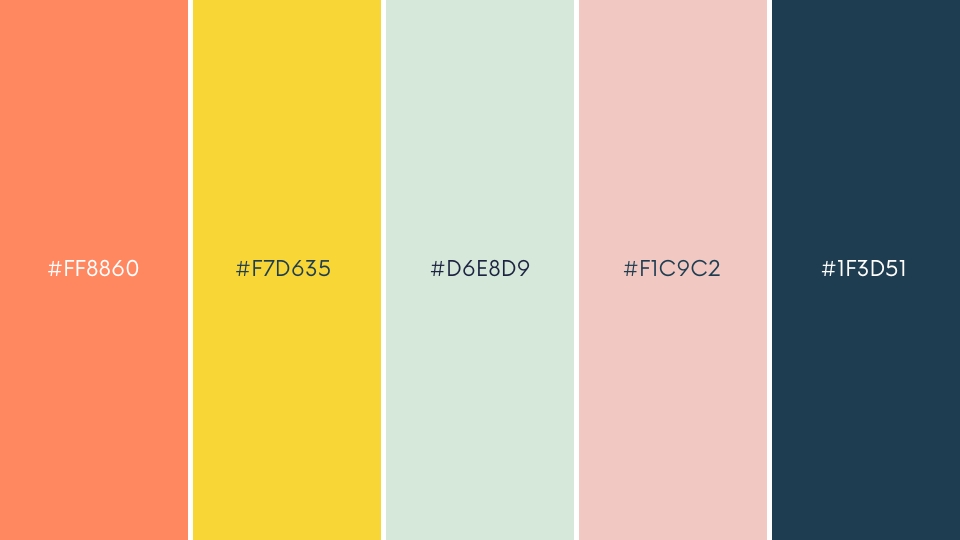
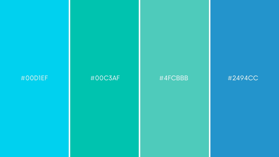
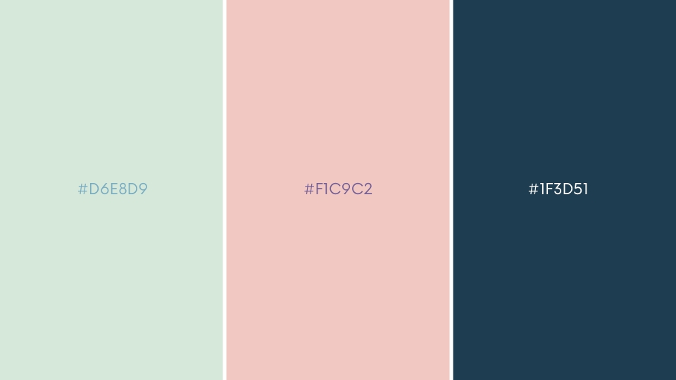
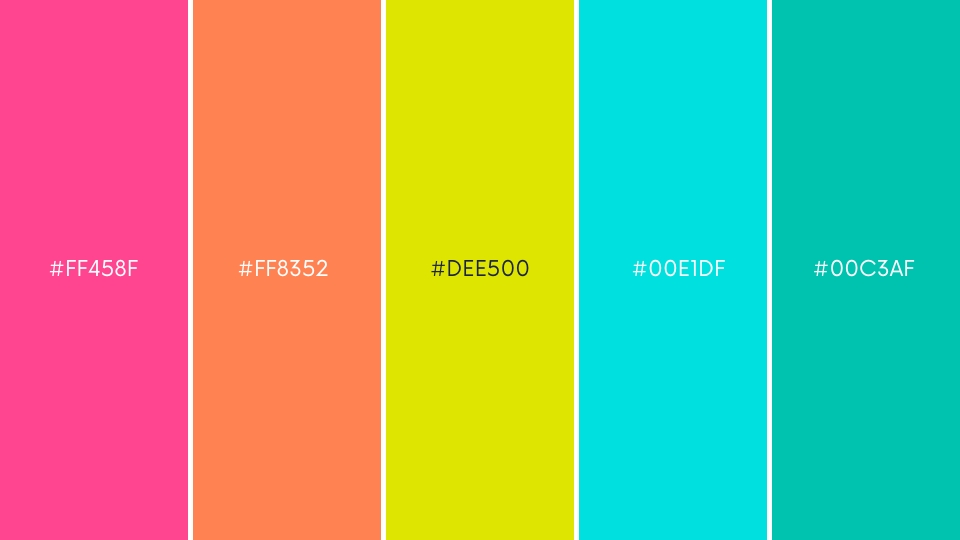
Examples of Summer Colour Palettes in Graphic Design
As the summer sun begins to shine, graphic designers around the world are on the lookout for fresh and vibrant colour palettes to enliven their designs. A well-curated summer colour palette can infuse a sense of energy and joy into any design project, making it the perfect time to experiment with bold and daring hues.
To help you create eye-catching designs that capture the essence of the season, we have put together a list of summer colour palettes which will be the perfect examples. So, grab your sketchbook and get ready to draw inspiration from these stunning colour combinations.
Giant Goldfish
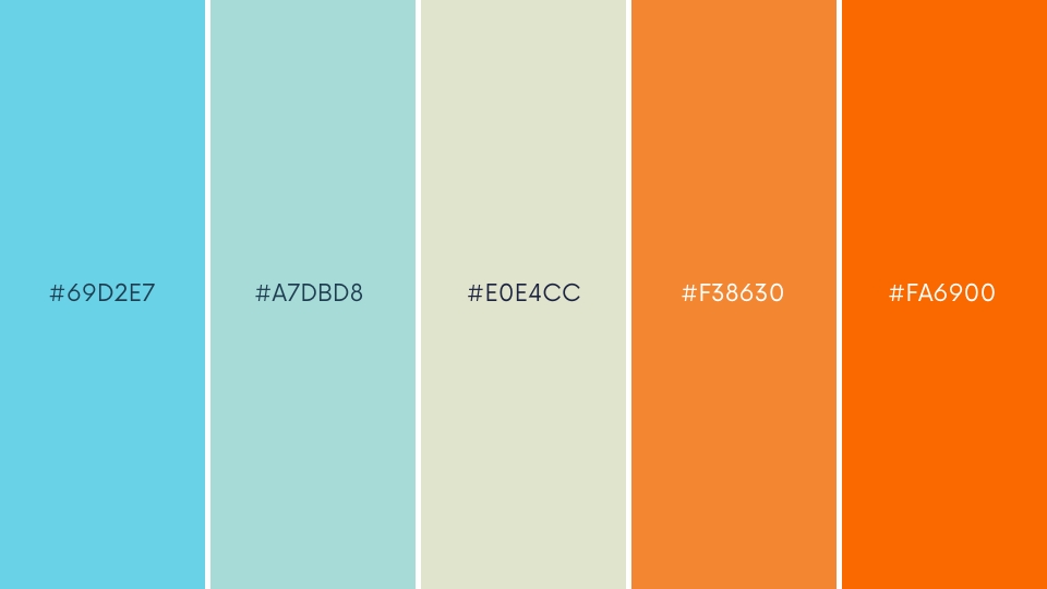
Manekineko designed the colour palette Giant Goldfish, which comprises the colours #69D2E7, #A7DBD8, #E0E4CC, #F38630, and #FA6900. This palette is well-known and has been utilized in a variety of applications, including graphic design, Minecraft skins, and creative challenges. You can access the palette on websites such as Colorpod, Colourlovers, and Colour-hex. The Giant Goldfish palette is a mix of warm and cold colours that may be utilised in your designs to create a lively and dynamic ambience. You can use this palette as inspiration for your next project or try to create something using only the colours in this palette to maximise your creativity.
Lookin’ like Summer
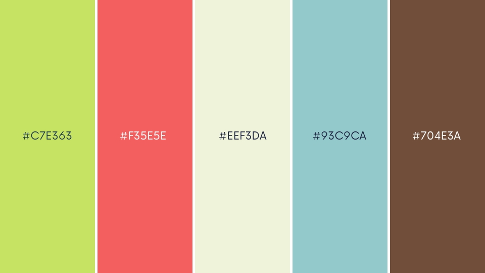
Lookin’ Like Summer by LaughingJacks is a graphic design colour palette for summer. LaughingJacks produced the Lookin’ Like Summer palette, which is a mix of warm and cool colours such as blue, green, yellow, and pink with hex codes #C7E363, # F35E5E, # EEF3DA, #93C9CA, and #704E3A. In your summer-themed designs, this palette can be used to create a cheerful and energetic mood. There are many more summer colour palettes accessible online that you can use as inspiration for your design. Design Tutsplus, for example, offers a tropical summer colour palette with mostly red tones, while Pixlr offers five summer colour palettes with various themes, such as fresh, fun, and flirty.
Berry Summer
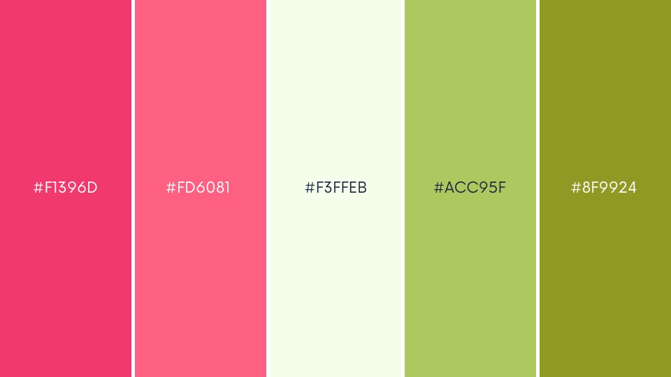
Berry Summer by Emmalaiho is a colour palette available on Colourlovers. It is a combination of warm and cool colours, including shades of pink, purple, and blue, with hex codes # F1396D, # FD6081, #F3FFEB, #ACC95F, and # 8F9924. This palette can be used to create a refreshing and vibrant atmosphere in your summer-themed designs. Other summer colour palettes are also available online that you can use as motivation for your design. For example, Easil provides five colour palettes for summer-ready design, including Shades of Berry, which is a combination of berry tones and dim colours.
Hazy Summer
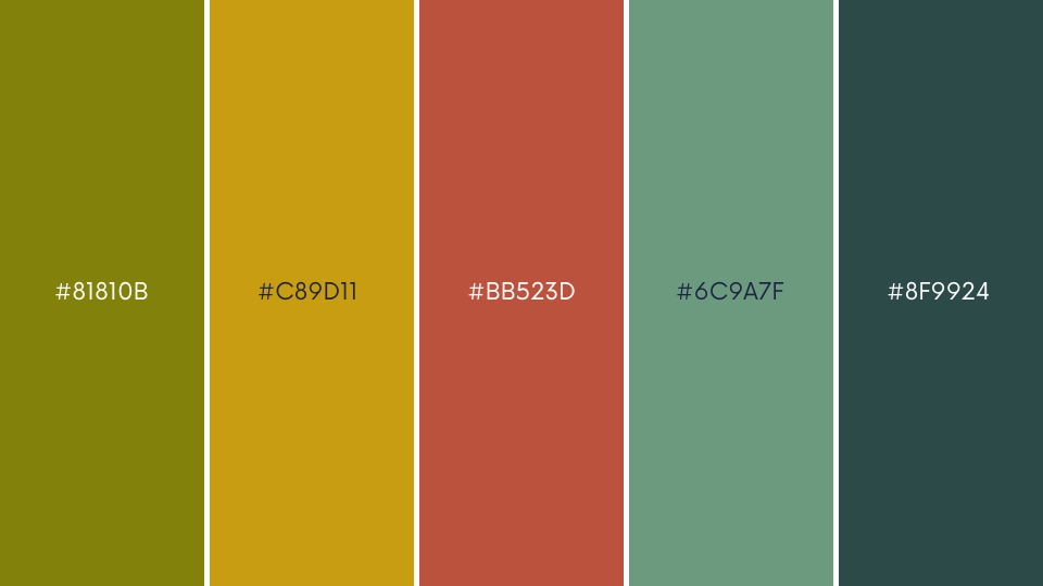
Hazy Summer is a summer colour palette for a graphic design created by nine70. The Hazy Summer palette was produced by nine70 and consists of warm and cold colours such as blue, green, and yellow with hex codes #81810B, #C89D11, #BB523D, #6C9A7F, and #2C4A47. In your summer-themed projects, this palette can be used to create a hazy and dreamy ambience. There are many more summer colour palettes accessible online that you can use as inspiration for your design.
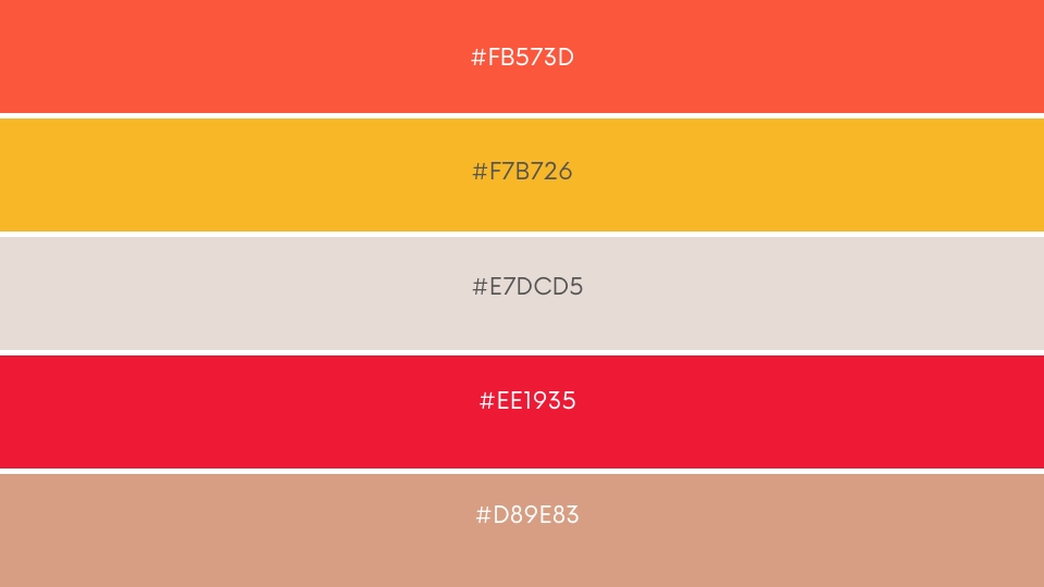
Summer Decadence
The Summer Rain palette by Monnacat features a beautiful range of warm and muted hues that are reminiscent of a summer rain shower. With hex codes ranging from #F5ECCD to #F59777, this palette offers a mix of light and dark tones that can add depth and complexity to any design. The soft yellows and pinks evoke the warmth of a summer afternoon, while the deeper oranges and reds capture the energy and excitement of a passing storm. Whether it is for branding, web design, or print media, the Summer Rain palette is a versatile and eye-catching option for any project.
Embrace the Warmth and Vibrancy of Summer Colours
In summary, summer colour palettes provide a plethora of options for graphic designers wishing to infuse their designs with a sense of vitality, excitement, and warmth. The season provides a rich source of inspiration for colour combinations that can make your creations stand out, whether it is the brilliant and bold hues of a tropical sunset or the cool and soothing tones of a coastal refuge. Designers may create magnificent graphics that express the essence of the season and attract the attention of their audience by experimenting with different tints and hues. So, embrace the brilliance of summer colours and use them to inspire your next creative project.

Rahul Shevde

