Browse our color combinations to step up your creative game and reap the rewards. Knowing what colors go together is a skill in itself and it can have a positive impact on all areas of your life. Once you gain an understanding of what different colors mean and the theory of color, you’ll see how they can influence perceptions. You can then use this to your advantage for personal or business use.
If you want to make your audience feel something, color can help to achieve this. It remains the same whether you are choosing colors for a flyer, a photograph, a business card design, and choosing the perfect color combination for a logo or your website. Choosing the right color scheme for your brand or website is as important as selecting the right font for your logo design or ensuring you have a captivating brand name.
Looking for places to manage your color combinations? Eagle is here to help! Eagle is a desktop productivity tool that enables a powerful organizing system for all types of design files. It can add tags, ratings, and even color-search to help you quickly find a specific file or color palette inpiration among thousands without getting lost! Try Eagle and start a new design journey.
Table of contents:
- ● Knowing What Color Combinations Work is Key
- ● Finding What Colors Go Well Together
- ● Color Combination Chart
- ● Color Combinations
- ● Color Combos That Use Two Colors
- ● Color Matching with Three Colors
- ● Colors That Go Together in Fours
- ● Trending Color Palettes
- ● Logo Color Combinations
- ● Ready to Make Your Own Color Palette?
Knowing What Color Combinations Work is Key
Imagine you are at the beginning of the product design process and you want to choose the right color combination that will inspire your audience – or make them feel happy or calm. Using the right color combinations can reinforce your intentions. To connect with your audience, using color symbolism to provoke emotions comes into play. Brands need to think about color combinations across many areas like logos, websites, marketing materials, merchandise, and social media. It’s not enough to work with just one color, the real magic lies in knowing what 2 or 3 colors go together and being able to pick compelling color combinations.
Ensure brand consistency by documenting which colors and combinations people should use. Creating brand guidelines ensures that you and your business’s marketing will be cohesive. This post aims to draw your attention to a number of color palette ideas with accompanying hex codes that might be suitable for your needs. Simply browse the color palette ideas and read the accompanying descriptions to decide if the color palette could be a good fit for you.
Finding What Colors Go Well Together
Color Wheels are an effective way of finding what colors go well together. It is impossible to go wrong by following strict color theory. However, using colors that historically go together doesn’t mean your audience will connect with them. So, if you have chosen a few colors and like them, you can use wheels and theory to put missing pieces together. This will ensure consistency in your color choices.
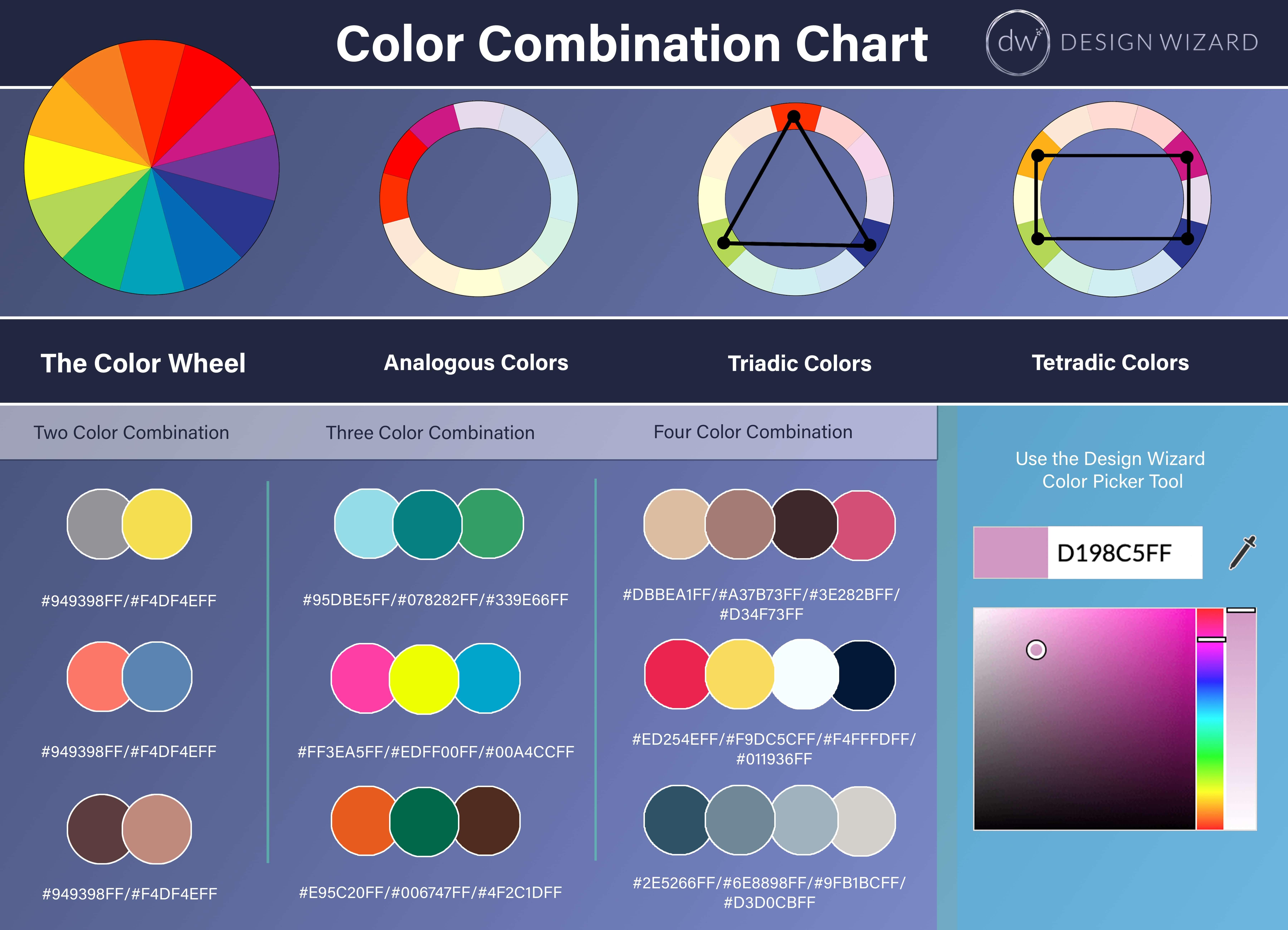
Color Combination Chart
We have created a Color combination chart that features our top tips and a snippet of our favorite color combinations for your use. All colors can be found by pasting the hex value (color code with a hashtag) into the design wizard color picker. For the best color-matching results, pay close attention to the color wheel and its components. Color matching will essentially improve your design’s visual appeal.
Color Combinations
Color knowledge can help you to make better choices in terms of buying clothes, shoes, decorating your home, even everyday communication! Life, in general, can be easier when you know what color goes with what. In this blog, we will look at the Top 75 Color Combinations.
To help inspire you, we are going to examine trending color scheme ideas, what colors go together, and suggest practical ways for you to use them. We hope you can find some color palette ideas you will like.
Interesting colors can be made even more so with the right color combinations. Color contrast can evoke powerful feelings from people, therefore choosing your color wisely is important.
Therefore, we have drawn up some of the best color combinations out there for you to feast your eyes upon. Some vibrant colors, others muted, you will be sure to find something you like.
Color Combos That Use Two Colors
Whether you are designing a logo, painting your house, or adding text to a video, more than likely you will be dealing with more than one color. If you are planning on having many different colors, it can often be easiest to start with two take it from there. In many cases, using only two colors can be just as effective as a larger palette. Here are some of the best two-color color combinations around.
Ultimate Gray (#949398FF) & Illuminating (#F4DF4EFF)
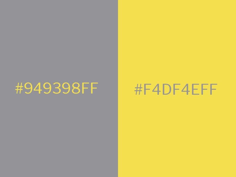
Pantone’s Color of the Year is a combination of the grounded Ultimate Gray and the vibrant Illuminating. This combination when revealed was described as “A marriage of color conveying a message of strength and hopefulness that is both enduring and uplifting.”
Gray is a cool and balanced color that is commonly used for most sophisticated designs. In our recent climate, the thought of brighter days ahead has acted as solace for people. Therefore, it is no surprise that a warm, uplifting yellow shade has been picked to represent the year.
Brighter shades of yellow can have negative connotations but this shade has been perfectly chosen. Utilize trending combinations like this one to show your audience that you are current. Avail of the symbolism of the merging of these colors to connect further.
Living Coral (#FC766AFF) and Pacific Coast (#5B84B1FF)
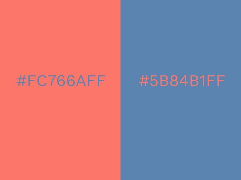
The 2019 Pantone Color of the Year was Living Coral. It’s a lively, nourishing color that has a youthful flavor to it. When combined with the refreshing blue of the Pacific Coast, it evokes images of the ocean floor and a vibrant seabed filled with coral.
Pacific Coast is deep, yet not overbearing, and complements the subtle tone of Living Coral. Atypical to most shades of blue, there is almost a certain warmth to it. This only serves to enhance the calm yet energetic vibe of Living Coral.
Dynamic color combinations like this one can be employed in so many different places, such as its unobtrusive nature. It’s relaxing to look at and can create a laid-back vibe wherever it is featured.
Ultra Violet (#5F4B8BFF) and Blooming Dahlia (#E69A8DFF)
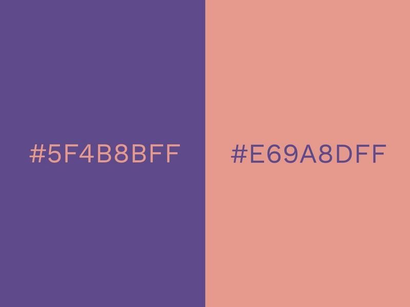
We can’t talk about trending colors without having Ultra Violet near the top of the list. This vivid, bold shade was the Pantone Color of 2018 and continued to feature prominently in the following years.
Purple is a strong and powerful color with positive connotations like magic, luxury, and creativity. For such an attention-grabbing color, it’s still surprisingly uncommon. In fashion and interiors, it tends to be used sparingly, but if there was ever a time to go crazy with purple, it is now.
Purple works well for marketing because it is so vibrant and pops off the page. This is one of the reasons why we chose it as our primary brand color! It is also super versatile and goes well with many other colors, such as green, red, and orange. But for a really cool color combination, try matching it with this warm pink/nude color. This particular shade is sophisticated and understated and gives balance to the rich and robust purple.
Turquoise (#42EADDFF) and Warm Sand (#CDB599FF)
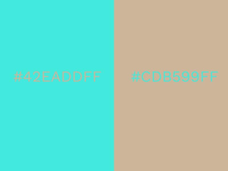
Is there anything more uplifting than a bright burst of turquoise? It is such a refreshing color that conjures up images of tropical waters and sunny skies. Turquoise is also unique in that it manages to be serene and idyllic as well as vivid and dramatic.
For many people, turquoise is the color of summer, so combining it with a soft, sandy shade creates a natural, harmonious balance. This neutral color wouldn’t win any prizes on its own but when laid alongside turquoise it becomes warm and golden. You can almost smell the salty sea breeze!
This color combination is natural and youthful and could be used for inspirational communication. Give a firm farewell to the dark days of winter with these gorgeous colors!
Black (#000000FF) and White (#FFFFFFFF)
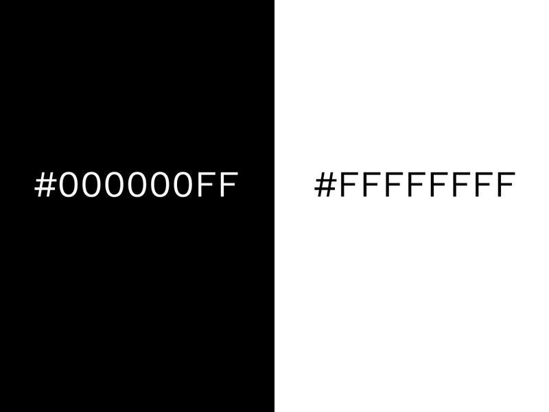
When it comes to classic color combinations, it doesn’t get any more timeless than black and white. But timeless doesn’t mean stagnant. From looking at 2021’s trend predictions, we can see that black and white is going to be huge.
The combination works because it creates ultimate balance. Black is strong and dominant and white is peaceful and pure. From a tonal point of view, they are polar opposites, but it is this contrast that makes black and white so effective together.
Individually, they can be overwhelming in large doses, but when placed side-by-side the two colors enhance each other. From a visual perspective, black becomes darker, and white is highlighted. The results are clean, crisp, and contemporary. Black and white are popular in all areas of design. Graphic designers and marketers use it to deliver powerful and clear messages, and it is a staple part of the fashion industry.
Black and white often feature in interior design when the desired impact is to be modern and crisp. Inject primary or neon colors to black and white to create a modern color palette.
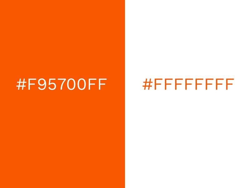
Blue (#00A4CCFF) and Orange (#F95700FF)
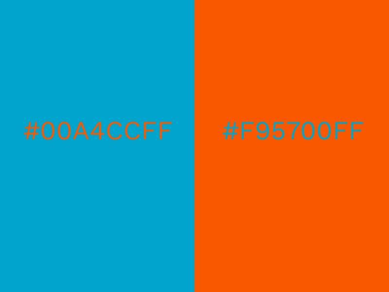
The classic pairing of blue and orange never fails to inspire; it is another good example of when opposites attract. The cool tones of blue emphasize the warmth that orange radiates. This pairing is often found in nature too and is meant to be comforting and familiar to the human eye.
From a communication perspective, the color combination of blue and orange has been used in countless posters, adverts, and campaigns over the years. It is a highly effective method of catching an audience’s eye.
Used most often in bold tones to grab attention, this year’s trend is in tweaking the saturation of either shade. This pastel take of the complementary blue and orange doesn’t diminish its effect. The energy from this blood orange shade sets off the soft powder blue perfectly. Blue is widely used to represent business and is always effective in marketing and promotion but the pop of orange shows that you are not afraid to stand out. Vibrant colors against a cool shade of blue will create feelings of trust while generating excitement.
Sailor Blue (#00203FFF) and Mint (#ADEFD1FF)
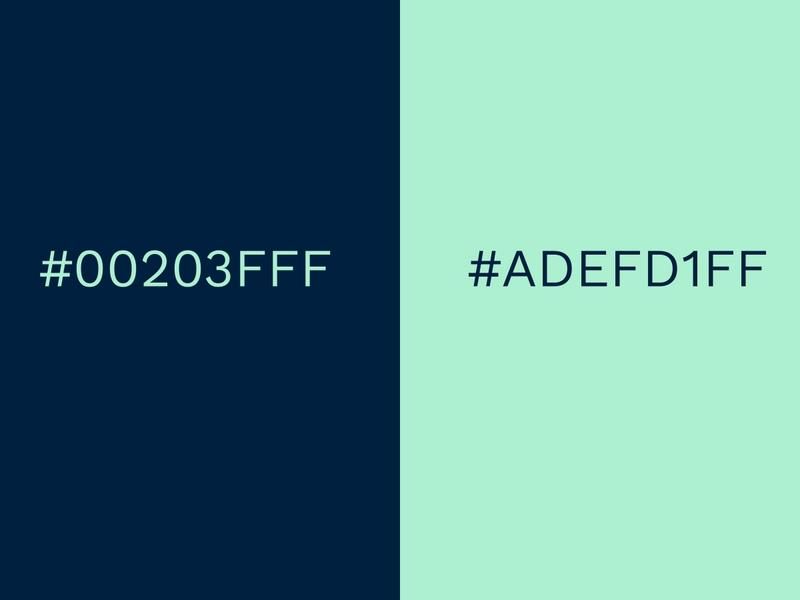
There is an old saying that claims, blue and green should never be seen without a color in between! While this is often true, there are exceptions to every rule – navy, and mint is one.
This is a surprisingly cool color combination because it is unexpected. This sorbet mint is fresh, zingy, and very much on-trend. Pastels have been prominent for some time now and show no signs of diminishing. The inky navy color is deep, rich, and almost masculine. When they converge the result is interesting and elegant.
Technically the tones should conflict, but in reality, the subdued rich navy offers a solid base for the vivacious mint. The darker hue acts as an anchor without being stark. This palette would be wonderful when worn together or as a living room or bedroom color scheme. The colors also work particularly well when used in typography.
Gray (#606060FF) and Lime Punch (#D6ED17FF)
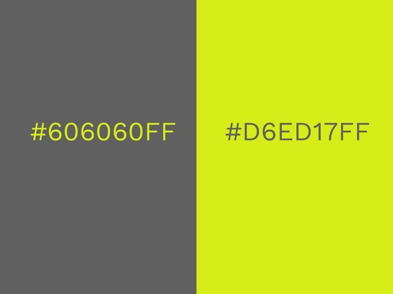
Forget orange – gray is definitely the new black. Sales in gray kitchens, cars, and clothes have soared in recent years because it is such an adaptable neutral. Gray can be warm or cool, hard or soft, it is exceptionally versatile and flattering.
Traditionally gray has a reputation of being flat or dreary, and there are times when that still applies (nimbostratus clouds, I’m looking at you!). But grays status has been elevated of late, and now it is synonymous with sophistication.
To really add a bit of personality and confidence, pair a deep shade of gray with a spirited splash of lime. This zesty shade is an important trend, but it should be used with caution! Lime green can be garish on its own, it can also be harsh worn on anything lighter than caramel skin tones. But when applied well it makes a striking statement. This edgy color combination is our personal favorite here at Design Wizard!
Cherry Tomato (#ED2B33FF) and Rapture Rose (#D85A7FFF)
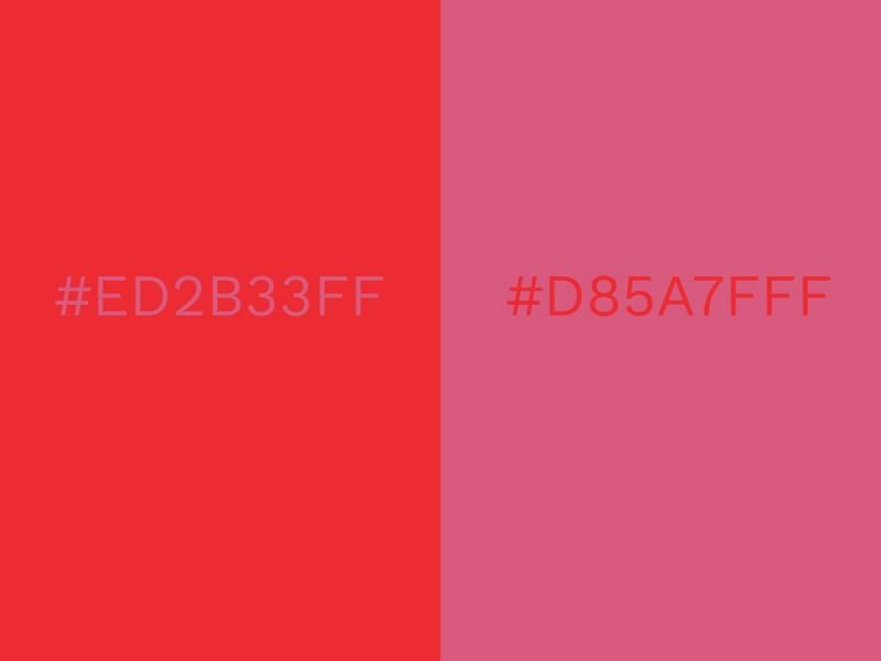
Another combination that challenges the rules is this tomato red and dusky pink. Red and pink can sometimes be an eye-watering combination, and not in a good way! But it can work – the important thing to get right is the balance of tones.
This twosome is successful because neither are vying for attention. They are close in terms of saturation – or in non-designer jargon – the shade intensity. If either, or both, were brighter they would clash.
Red and pink are also a monochromatic color scheme which makes for a complementary palette. Monochromatic means that they exist in the same color family. White, gray, or black can be added to the base hue, which in this case is red. Mixing these together can create a variety of tints, shades, and tones, such as pink.
The beauty of this particular pair is that the two individual shades are cool and modern. The exuberant orange-red sets off the purple undertones of the pink. Include white to keep it crisp.
Forest Green (#2C5F2D) and Moss Green (#97BC62FF)
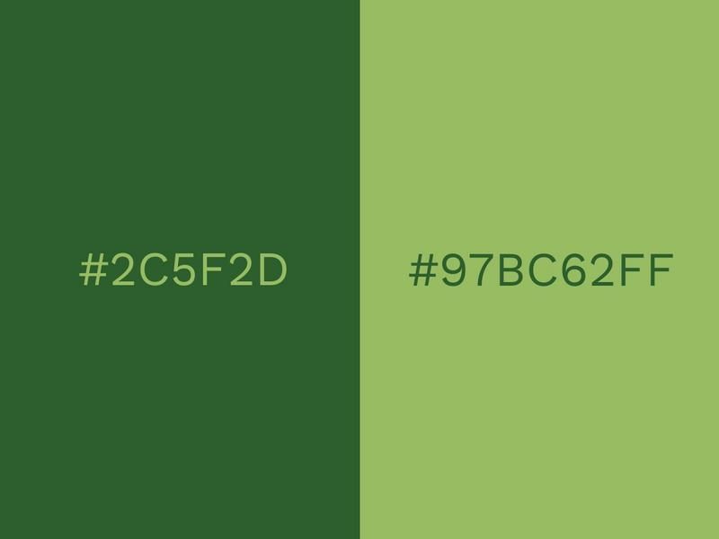
As we move further into the digital age, there is a growing effort to keep our feet planted in the real world. As stress and pressure increase, there’s more emphasis than ever to embrace the natural, wholesome and healthy aspects of life. In 2017, the Pantone Color of the Year was called Greenery and it truly reflected this movement.
Greenery: a light, bright grass green, really planted the seeds for this year’s version to develop. The moody Forest Green can almost look black in some lights but it is lifted by the refined tones of the Moss Green.
This green color palette falls into the same category as the monochromatic color scheme above, but it is much easier to work with (especially in the natural tones). For interior design, this combination works well when paired with wood. In fashion, it looks expensive, especially when worn with metallics (use rose gold for extra trendy points!). Green is also gender-neutral and suits most skin tones and hair colors. Utilize this green color palette to appear as grounded and natural.
Royal Blue (#00539CFF) and Peach (#EEA47FFF)
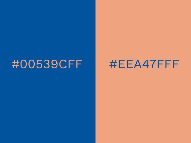
Royal Blue and peach is this year’s version of the classic blue and white (and not a million miles away from turquoise and sand).
Royal Blue is pretty much primary blue, so it is durable and solid. But because of its boldness, it is also playful. And there is a resurgence for the notion of playfulness. As the concept of creativity is becoming more prominent in our lives, from our architecture to our business strategies, playfulness is now socially accepted. This is also a nod to the 80s, which is having something of a revival in graphic design.
The trend of pastels came up earlier, and even though pink and lilac have been the most prominent so far, peach is in the spotlight now. Together they really combine to create a super modern finish.
Electric Blue Lemonade (#0063B2FF) and Aquamarine (#9CC3D5FF)
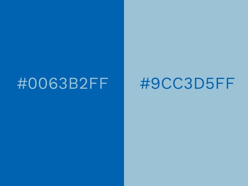
The duotone of Electric Blue Lemonade and Aquamarine has the potential to give your design either a professional or casual look, depending on how you create it.
The vivid Electric Blue Lemonade becomes more relaxed and amiable when accompanied by the softer Aquamarine.
Blue inspires trust and professionalism, so it is widely featured in color combinations that are used for business logos and websites. Dark blue brings sophistication and intelligence, while light blue is a source of honesty and clarity. A blue color palette encompassing this symbolism is a powerful tool to gain customers’ trust.
Orchid (#D198C5FF) and Cream Gold (#E0C568FF)
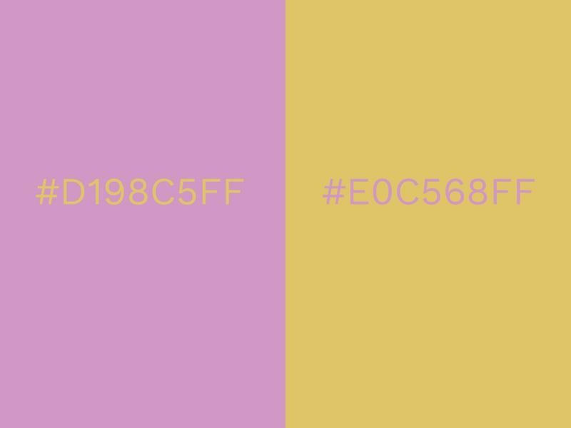
Orchid is a striking shade of pink that strays tentatively into the territories of purple. It’s girly and fun, but slightly more mature than some other pinks.
Cream Gold is luxurious and warm, with a liquid gold texture that’s enticing to the eye. Orchid beautifully enhances this effect, blanketing Cream Gold smoothly.
It’s a combination that gives a certain elegance to a design. Pink and gold have substance to match their style. This makes it a very popular choice for weddings and engagement parties.
Black (#101820FF) and Blazing Yellow (#FEE715FF)
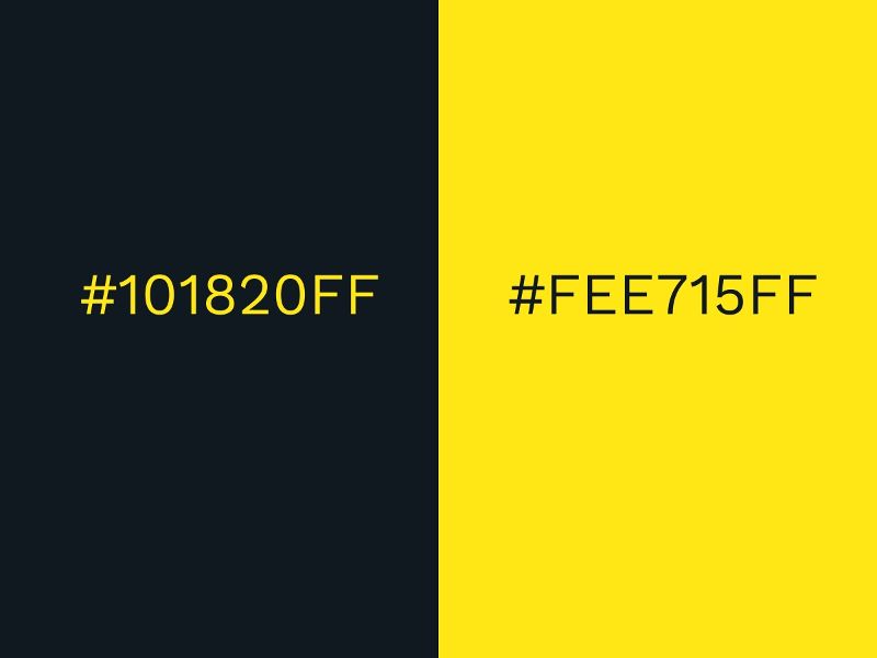
Probably one of the most common contrasting color combinations, black and yellow are used in so many different situations. Due to its prominence, you’ll find it on many hazard signs to notify people of danger.
Yellow has been known to stimulate mental activity and when combined with the depth of black, it’s ideal for creating a contrast that makes things easy to read and easy to understand.
Black is a mysterious color that represents the unknown, but Blazing Yellow appears more welcoming and close at hand. Use bright colors with darker ones, to create visual contrast.
Pale Green (#CBCE91FF) and Bubblegum Pink (#EA738DFF)
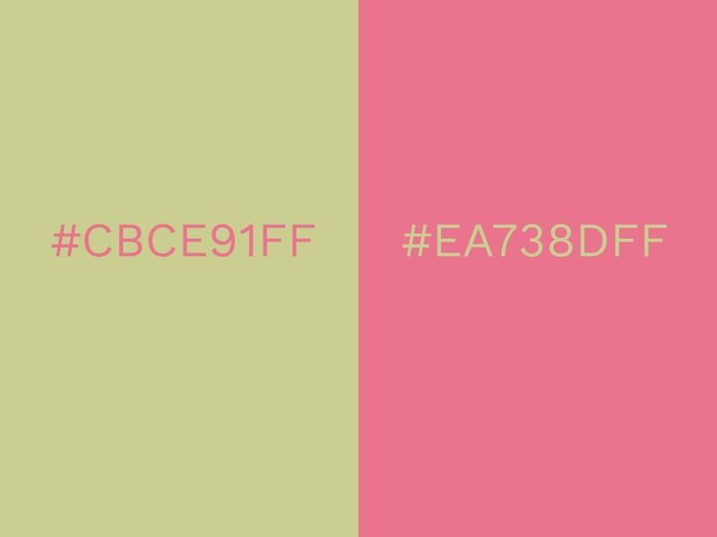
Pale Green and Bubblegum can be a surprisingly effective color combination. The bright Bubblegum contrasts with the subtle Pale Green to just the right degree.
The contrast between the two colors is what makes them stand out so much when combined. There’s something unexpected about pink and green that really catches the eye. Despite their difference in appearance, these unique colors compliment each other brilliantly.
You could fill the majority of your design with Pale Green and use Bubblegum to fill in the dots. Even when used in small amounts, Bubblegum still has the presence to be noticeable.
Copper Coin (#B1624EFF) and Aged Copper (#5CC8D7FF)
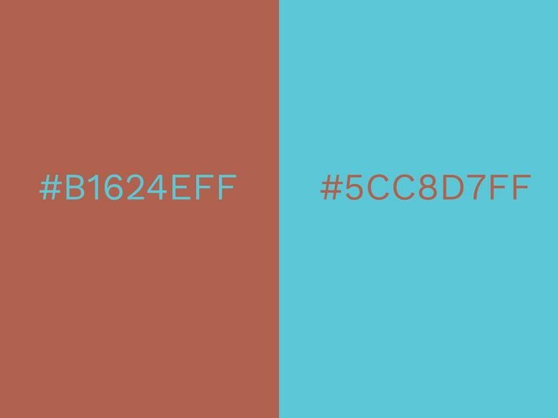
The shimmering brown of copper eventually turns to turquoise with the passing of time. With Copper Coin and Aged Copper, the two spectrums of copper can bridge the gap in years to form a stunning combination.
You can make your new designs look notably vintage with the right amount of tweaking. Aged Copper is of course a turquoise shade, so it easily conveys feelings of refreshment, calm, and serenity.
Copper Coin is wholesome and secure, but its coin-like texture also reminds us of money, piping, and other copper objects.
Sky Blue (#89ABE3FF) and White (#FCF6F5FF)
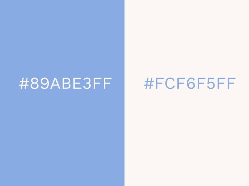
The sky blue color palette has a nordic white to accompany it. The relaxed, tranquil combo of Sky Blue and white evokes images of fluffy clouds passing through a clear blue sky. Sky Blue is a color of openness, honesty, and respectability.
A pure white hue only serves to enhance the feeling it creates. There are few colors that don’t work well with white, and Sky Blue is up there with the best.
It’s professional, sophisticated, and laid back at the same time. It’s a color combination that doesn’t demand too much attention and because of that, it rarely looks out of place.
Dusky Citron (#E3CD81FF) and Cool Gray (#B1B3B3FF)
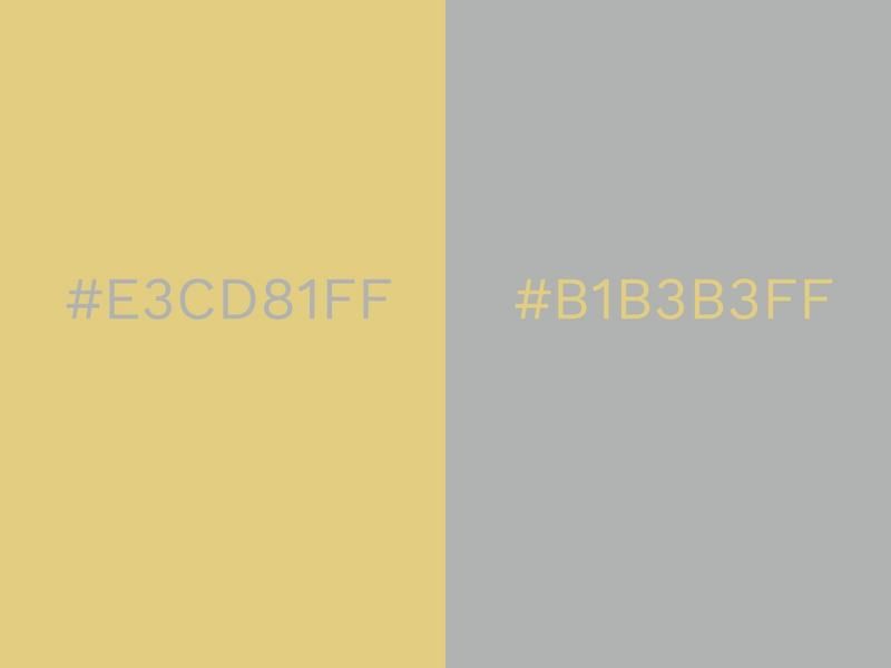
Dusky Citron and Cool Gray serve as an alternative version of the classic gold and silver color combination. Dusky Citron is a beautiful pale tone of gold that exudes class and sophistication.
Citron is a large yellow-gold citrus fruit that was one of the original fruits in the genus. Citrus fruits are known for being refreshing and thirst-quenching, which helps give this combination a stimulating effect that more severe gold and silvers couldn’t achieve.
Cool Gray fulfills the role of silver here, and while it’s essentially your standard gray, it has enough of a delicate silver look about it to create a sense of grace and elegance.
Black (#101820FF) and Orange (#F2AA4CFF)
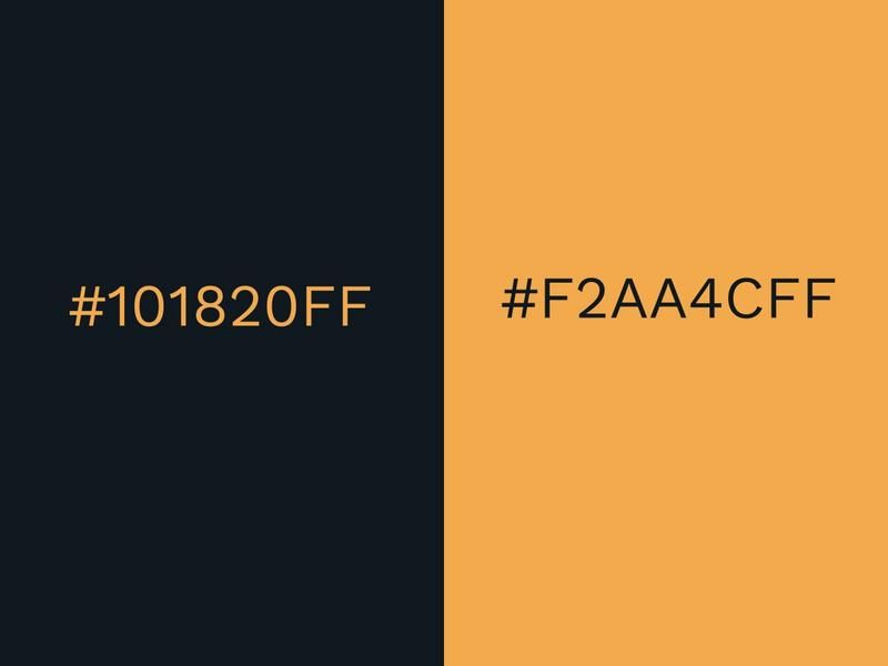
A strong black is combined with a fun and positive shade of orange. Dark and light colors can work very well if mixed correctly. Contrasting colors is one of the most powerful design tools. Few look as well together as black and orange. Orange acts like an illuminating spotlight in the pitch-black night.
It’s a bold and eye-catching color combination that oozes contemporary style. Black is sincere and practical, but orange is full of creativity and exuberance.
Like black and yellow, black and orange are often used in roadside signs to make them more noticeable and legible.
Brown Sugar (#A07855FF) and Beige (#D4B996FF)
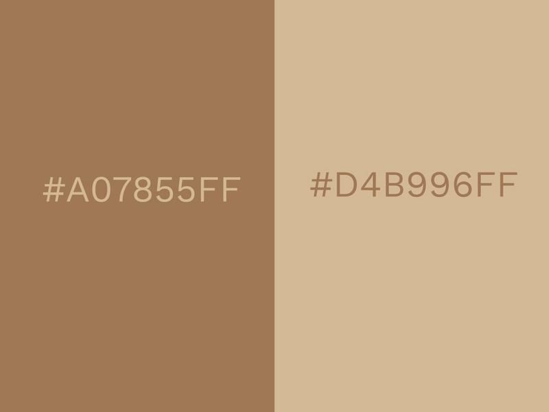
Brown Sugar and beige are a delightful combination of colors; envisage cozy brown leather sofas and walls painted a calm shade of beige. It’s one of those color combinations that’s ideally suited for creating an interior design that makes you feel comfortable and warm.
It’s relaxed, reassuring, and exudes a certain maturity that is hard to replicate. Brown is typically a wholesome, stable color, while beige is dependable and calm, so naturally, they are two colors that go together well.
It’s easy to imagine Brown Sugar being the outer coating of a chocolate bar and then biting into the bar to reveal a delicious beige inside.
Turkish Sea (#195190FF) and Silver (#A2A2A1FF)
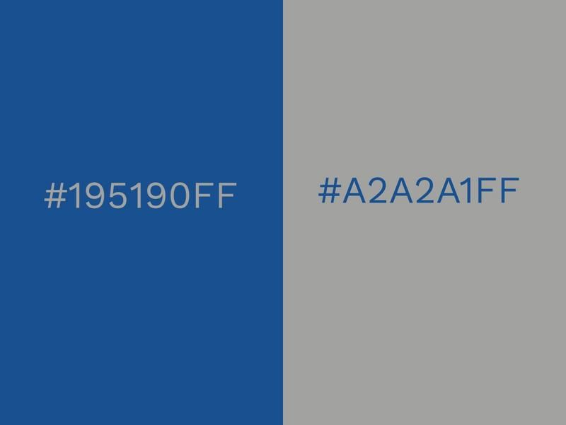
Discover some amazing underwater treasure in the form of silver submerged in the Turkish Sea. Silver is perhaps not the most likely color to combine with blue, but in this case, it works brilliantly.
As far as business-related color combinations go, Turkish Sea and silver have the potential to be up there with the very best. The assured professionalism that blue brings is complemented by a classy shade of silver.
Blue and silver are both also symbols of providence and trust, which are exactly what businesses want their customers to associate them with.
Royal Purple (#603F83FF) and Ice Flow (#C7D3D4FF)
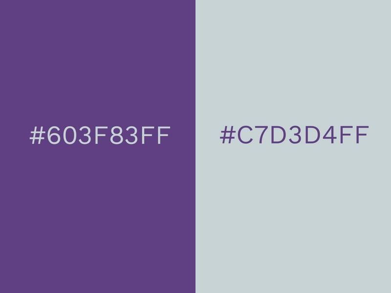
Neutralize the powerful Royal Purple with the chilling Ice Flow. Purple is a color that’s regularly associated with royalty, ambition, and power. Combining it with a grounded gray like Ice Flow creates a nice balance in a composition.
Any color named Ice Flow is bound to be somewhat arctic in its disposition and, true to its name, Ice Flow is cool and reserved. On its own, it could easily be labeled a drab gray, but alongside Royal Purple, it brings a lot more to the table.
You could say that the practicality of gray sets the foundation for purple to roam free and let its boundless imagination run wild, resulting in stunning creations.
Island Green (#2BAE66FF) and White (#FCF6F5FF)
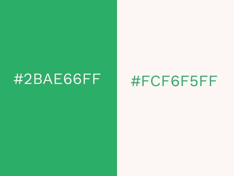
The idyllic Island Green and white color combination is clean, crisp, and highly flexible. When green is mixed with white, its positive connotations are brought to the fore. Examples of these are growth, renewal, and environmental awareness.
Island Green is very down to earth and like most greens, it has an association with nature, which a pure white can also be seen to have. In some countries, dark green is seen to be a sign of wealth.
There is a real sense of color harmony when green and white are combined.
Pink Salt (#FAD0C9FF) and Charcoal Gray (#6E6E6DFF)
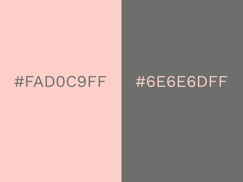
Pink and gray are maybe not one of your classic color combinations, but they provide a striking contrast. The serious Charcoal Gray is imbued with new life by the vigorous Pink Salt. It’s a great example of how a youthful color can work wonders when combined with an evidently more mature one.
Pink is playful and leisurely, while gray is workmanlike and professional. A color like Charcoal Gray might be accused of being drab when seen alone, but when accompanied by Pink Salt it grows in stature.
A color such as Pink Salt instantly makes a color combination more approachable and enjoyable. It’s commonplace to feel more comfortable engaging with color combinations that are bright and welcoming, rather than those that are dull and uninspiring.
Black (#2D2926FF) and Cherry Tomato (#E94B3CFF)
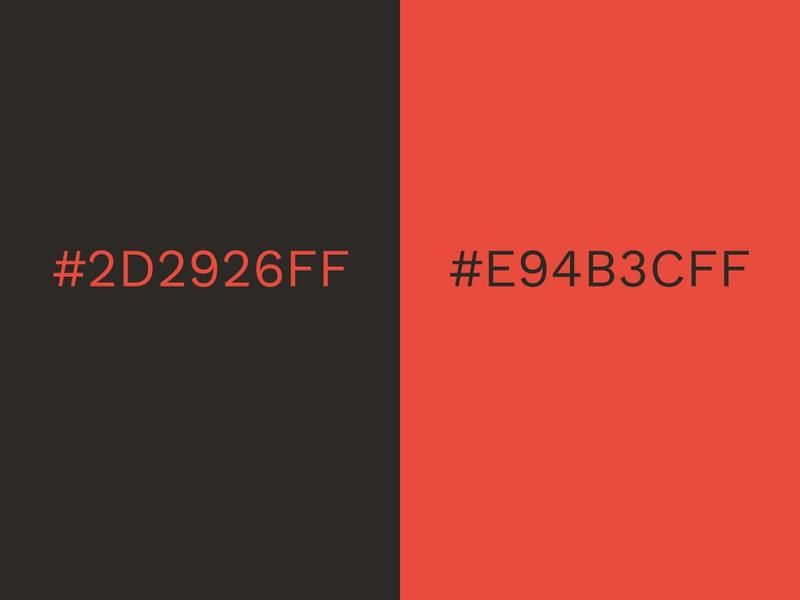
Cherry Tomato has a beautifully intense red glow that radiates from the design. This powerful glow is highlighted by the inclusion of black.
Red and black have always made for a good combination and no matter what shade of red you use, it should comfortably fit in alongside black. There’s a ferocious, powerful vibe off this color combination, so it’s no surprise that the Targaryens of Game of Thrones use red and black as their colors!
If you plan on making a fiery design that shows you mean business, experiment with a color scheme such as red and black. Contrasting colors like these will always be effective in getting a strong message across.
Mango Mojito (#DAA03DFF) and Terrarium Moss (#616247FF)
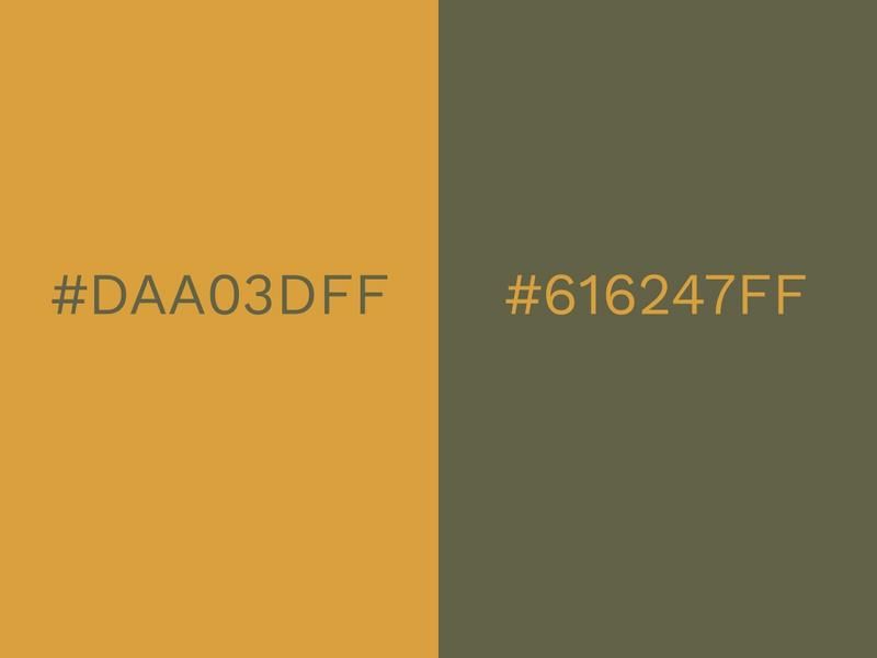
Just like the drink that this color is named after, Mango Mojito is a delicious, pleasurable shade of yellow-gold. Terrarium Moss is an earthy, green-brown and, while you might not initially think these are two colors that go together, they do look great side by side.
Yellow and green are two colors that represent life and growth. We find renewed energy in this refreshing color combination. When mixed together, they make a luscious lime green shade. In addition to this, yellow and green are analogous on the color wheel.
A business could use these colors on their to highlight their environmental awareness, but also show that they are creative and cheerful.
Space Cherry (#990011FF) and White (#FCF6F5FF)
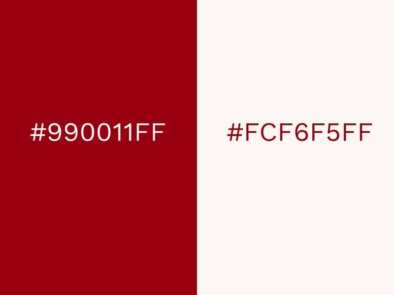
A pearly white plays off the deep red of Space Cherry in stunning fashion. It’s no coincidence that red and white is a standard color combination for a wide array of sports teams and businesses.
It could look amazing when used on the walls of your house, where the white gains an added radiance alongside the cherry-red walls.
The white gives the strong and stimulating red some balance and adds a touch of lightness to it.
Hunter Green (#435E55FF) and Raspberry (#D64161FF)
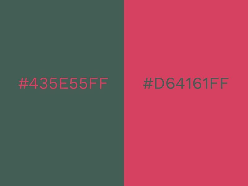
Hunter Green is a gloriously deep color that makes you think of a lush and expansive forest. Raspberry is a deliciously fruity contrast that helps create a color combination that has a natural, wholesome flavor to it.
Green symbolizes clean living and health, and when interspersed with Raspberry, you get an energizing splash of passion and playfulness.
As Raspberry is a sort of pink-red color, it could take on a wide variety of meanings in the eyes of color psychology. This color combination could be fantastic for advertising health products or organically produced foods.
Pale Green (#CBCE91FF) and Purple Sapphire (#76528BFF)
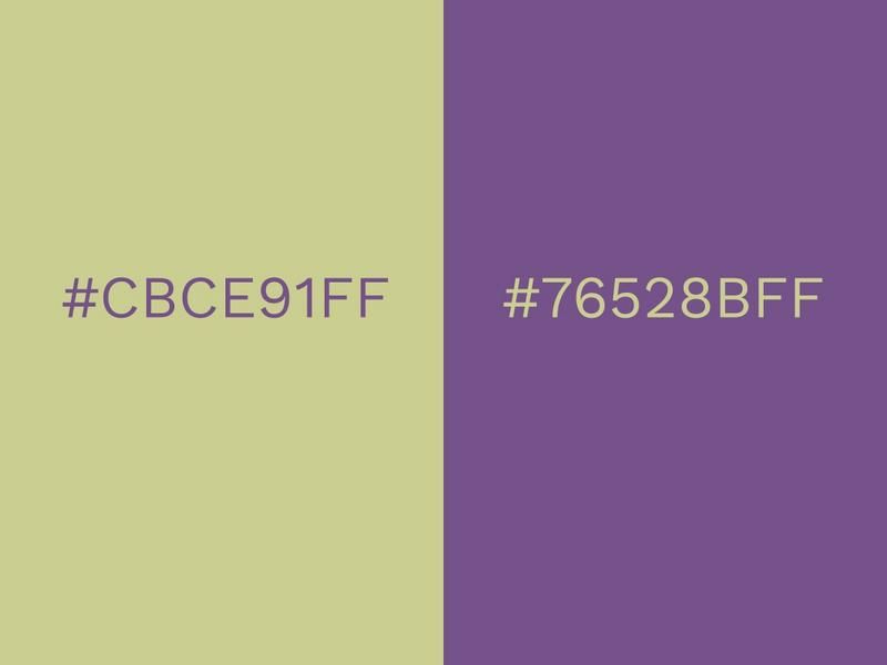
To create color harmony, you won’t have to look much further than Pale Green and Purple Sapphire. Green and purple are extremely complementary colors, even though they contrast so much.
The contrast is indeed a spectacular one, and it can be seen in many gardens. Purple flowers can look absolutely stunning in a sea of green.
Both purple and green are positive colors that imbue a room or a composition with increased vitality and energy.
Pink (#FAEBEFFF) and Navy Blue (#333D79FF)
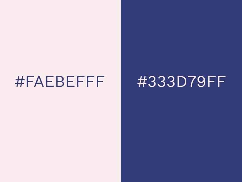
We see a very delicate, pale pink here accompanied by a reliable shade of navy blue. The contrast is obviously very noticeable, but the two colors compliment each other magnificently.
It’s a very neutral color combination, as it could be used in a variety of instances. For example, pink and navy are two colors that go together when it comes to clothing. The navy acts as the demure half of an outfit, while the pink grabs the attention.
Pink in itself can have multiple interpretations. Lighter hues of pink, such as this one could be seen as gentle and peaceful, while brighter pinks might be considered symbolic of sweetness.
Bright Red (#F93822FF) and Cyber Yellow (#FDD20EFF)
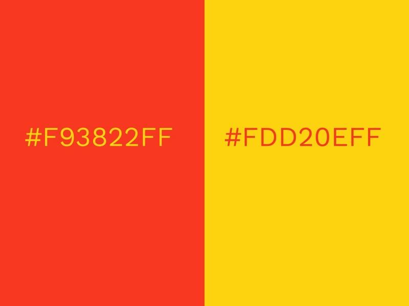
Stand out from the crowd with a Bright Red and Cyber Yellow color scheme. This color combination can be really effective for advertising and creating sales posters.
The eye sees yellows first and this helps to enhance the effect of the message you are trying to get across. It inspires quick decision-making and coaxes the viewer into taking action. Bright Red is also a thought-provoking color that inspires movement. Yellow and red are also said to increase hunger, which is why so many food brands use them on their packaging.
Ultimately, the color combination of red and yellow is extremely captivating. Bright colors burst forth from a design and launch an assault on the senses. Even on their own, red and yellow are both powerful. vibrant colors.
Sweet Corn (#F2EDD7FF) and Toffee (#755139FF)
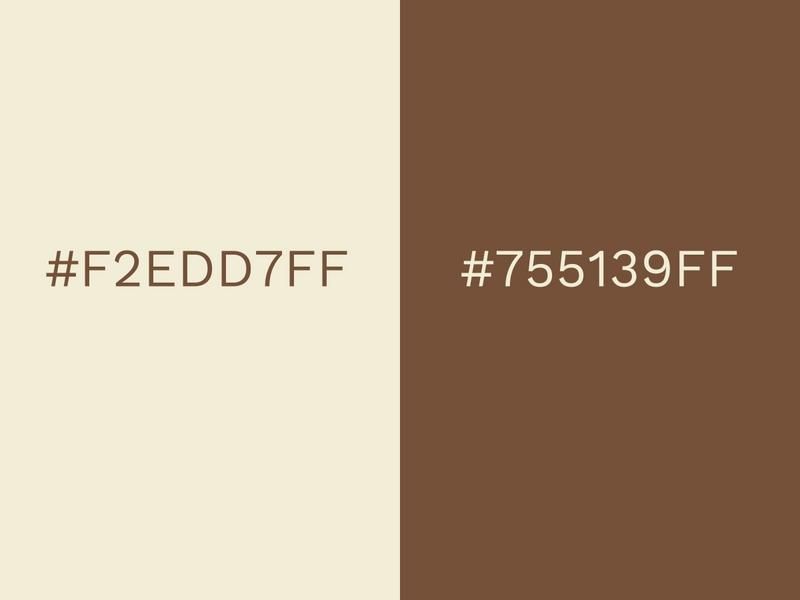
Toffee instantly conveys imagery of lots of tasty toffee, but set that aside for one minute and consider the more reserved Sweet Corn. Its subtle white tone gives this color combination a thoroughly delicious texture.
Think chocolate and milk, for example. One might be seen as luxurious and pleasurable while the other could be seen as healthy and stable. This is one of those color combinations that follow suit with real-life scenarios.
Toffee would be too dark and uninspiring on its own, but when combined with Sweet Corn it gets a huge lift.
Dark Green (#006B38FF) and Black (#101820FF)
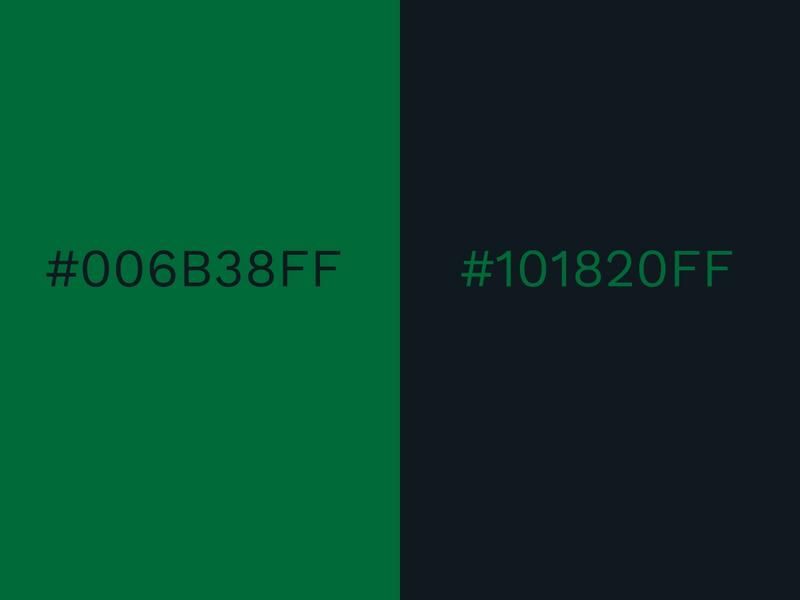
Dark green and black is a color combination that looks strong and impactful. It’s an assured and confident mixture that symbolizes vitality and a certain degree of maturity.
By using a darker green, you can almost blend it into black. While this is one of the more dusky color combinations, it can still shine bright when given the chance.
When used on clothing, it can give a classy, modest look to an outfit. However, if you were to employ this color combination in a room, it might come across as too gloomy. Make sure to use this dark color palette in the right situation.
Orange (#F95700FF) and White (#FFFFFFFF)
Due to the fact that orange is such a loud, vibrant color, teaming it up with a neutral color like white can result in an outstanding color combination.
A lighter shade of orange would be good here too, but if you want to really show your fun side, splash out with this vivid shade of orange. Bold orange can be a divisive color, just as many people will say they love it as those who hate it.
If you go with this shade of orange, it’s best to go all out! Take liberty with it on your walls, your clothes, and your designs.
Aspen Gold (#FFD662FF) and Princess Blue (#00539CFF)
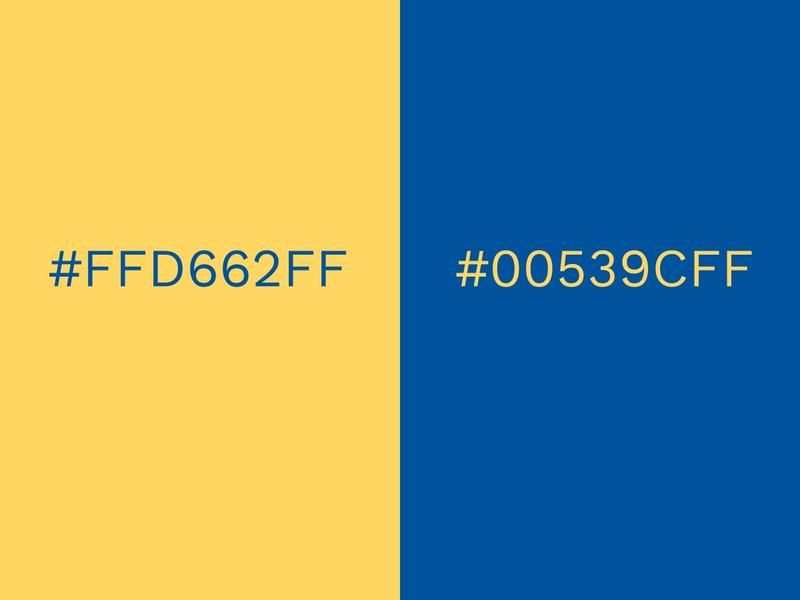
Aspen Gold is a gorgeous shade of yellow-gold that brightens up a design like a field of daffodils. Princess Blue is akin to the graceful Morpho butterfly landing delicately on their petals for nectar.
Yellow and blue are two colors that go together really well. Aspen Gold brings warmth and optimism, inspiring us to feel positive and look to the future with renewed hope. Princess Blue calms the boundless yellow and adds some responsibility and tranquility into the mix.
Picture the evening sky, still blue, but pierced by a collection of golden stars emerging from their hiding places. This is the type of effect you can achieve with some Princess Blue and Aspen Gold. The yellow really pops against the deep blue.
Soybean (#D7C49EFF) and Eclipse (#343148FF)
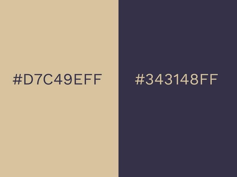
Soybean is a very flexible, neutral shade that can be mixed with almost anything on the color wheel. The nocturnal Eclipse is a complete contrast to Soybean, but it acts as an excellent companion to it.
These colors could be superb choices for an interior wall of a house and have a timeless look to them that makes sure they won’t be going out of fashion any time soon.
They won’t make someone go ‘wow!’, but they’re safe and dependable and won’t look out of place in most scenarios.
Cantaloupe (#FFA177FF) and Blush (#F5C7B8FF)
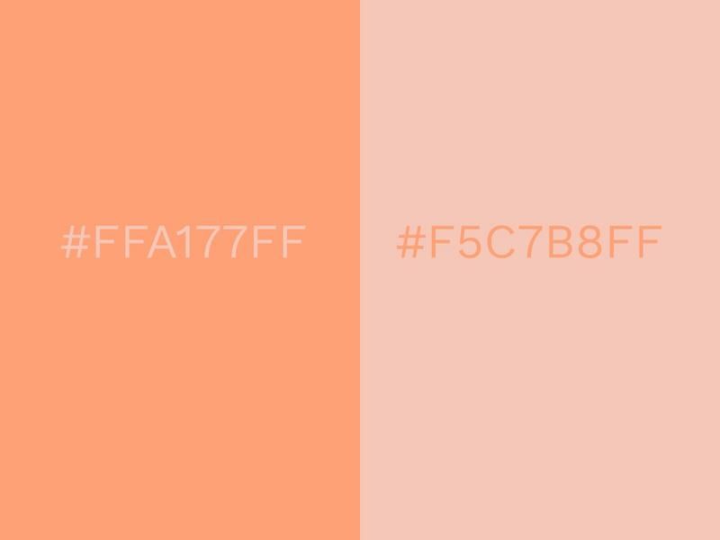
A warm and fashionable color combo, Cantaloupe, and Blush look like they’ve come straight out of a makeup set.
The warm tones are welcoming and approachable, encouraging interaction and engagement from someone viewing the colors. A mixture of orange and pink can be found quite frequently in the plant world.
Orange and pink flowers have a cozy, comforting vibe about them. This vibe can be replicated on interior walls or garments of clothing.
Rose Pink (#DF6589FF) and Purple (#3C1053FF)
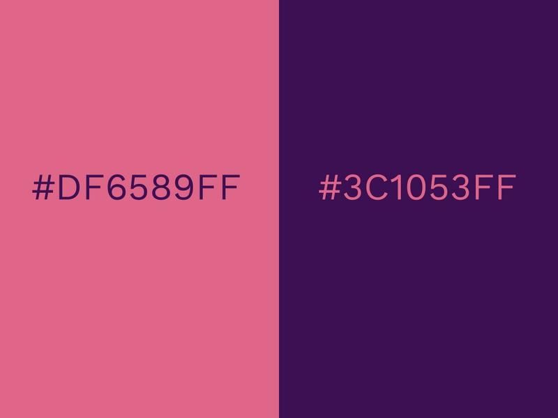
Rose Pink is an attractive companion to this confident shade of purple. Pink and purple are close together on the color wheel and this commonality ensures that they are two colors that go together well.
They are both darker shades of their respective colors and this changes how they are perceived. Purple and pink in this instance could be seen as signifiers of creativity and wisdom.
Naturally, people will associate pink and purple as being one of the classic feminine color combinations. It has been used prominently in campaigns that discuss female health, such as breast cancer awareness.
Mellow Yellow (#FFE77AFF) and Verdant Green (#2C5F2DFF)
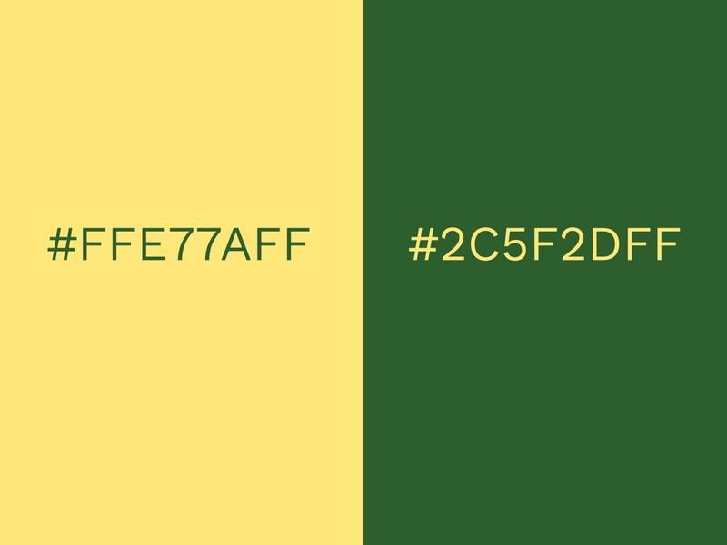
Imagine a shimmering yellow summer’s sun shining down on an evergreen forest. That’s what you’ll get with a splash of Mellow Yellow and Verdant Green.
It’s similar to the color combination of Mango Mojito and Terrarium Moss, but far lighter and softer. This combo is effective in creating a warm, welcoming aura.
Verdant Green, as its name suggests, is symbolic of growth and nature. Mellow Yellow is full of happiness and boundless joy.
Fiesta (#DD4132FF) and Jester Red (#9E1030FF)
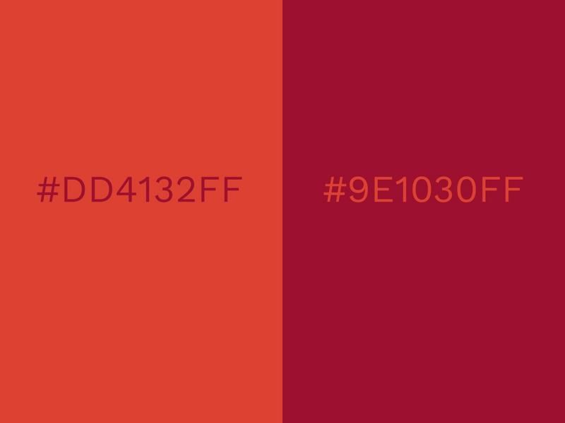
Let your fun and passionate side loose with a helping of Fiesta and Jester Red. As the name suggests, the red-orange Fiesta is the perfect party color.
As far as clothing goes, Fiesta and Jester Red make a superb combo. Different shades of orange and red can clash in some instances, but these two colors look amazing together.
Jester Red and Fiesta could even work as a duotone style design that ever so slowly blends together.
Powdered Sugar (#F1F4FFFF) and Silver (#A2A2A1FF)

Powdered Sugar is a stunning alabaster-white that combines superbly with a sharp and sophisticated silver. It’s a minimalist color combination that has been becoming increasingly popular in interior design.
Silver is a sensible choice of color that’s associated with modern technology, industry, and elegance. With these trendy associations, it’s no wonder that it can be found on the walls of so many homes.
Powdered Sugar and silver are both cool, relaxing colors that generate a vibe of sophistication and efficiency. Stay ahead of the curve by utilizing this modern color palette.
Lemon Tonic (#FCF951FF) and Purple (#422057FF)
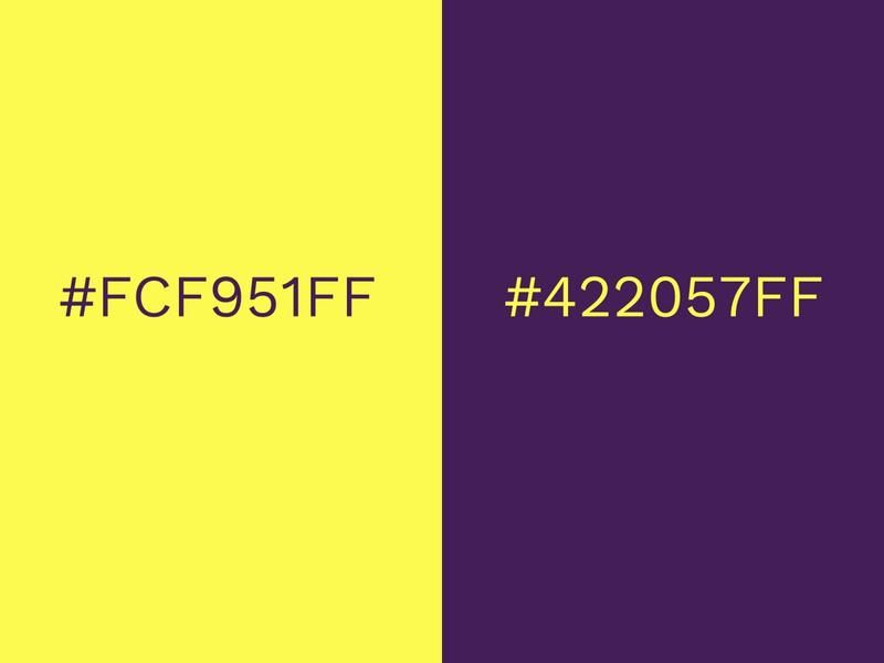
Mix this profound purple with some Lemon Tonic to create an amazing blast of color. The sheer brightness of this color combo makes it superb for using advertisements or social media posts that demand attention.
A new brand could choose to use color combinations like these in an attempt to be fresh and exciting. It’s not a color combo that’s likely to get lost in the crowd.
Iconic basketball team, the LA Lakers, are proud proponents of yellow and purple. They have used the two colors on their shirts since 1967.
Teal (#4B878BFF) and Fiery Red (#D01C1FFF)
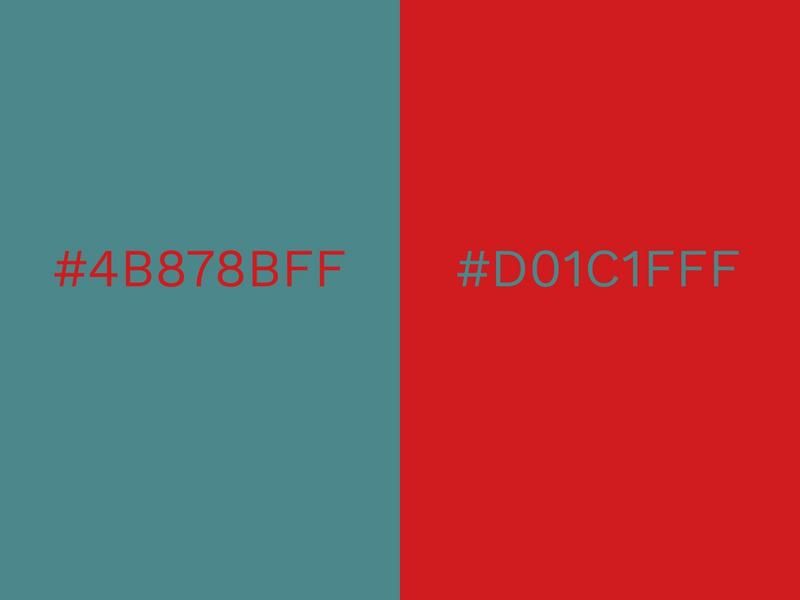
The fervent Fiery Red roars hot beside a cool and gentle teal. It’s a contrasting mix, but one of the classic color combinations nonetheless.
Red and green evoke images of Christmas and families gathering around an open hearth. We think of wreaths hanging from doors and beautifully decorated Christmas trees standing tall in living rooms.
However, teal and Fiery Red can easily look good at other times in the year. Red leaves falling on green grass is an example of how the combination can also be a reminder of stimulating nature scenes.
Nebulosity (#1C1C1BFF) and Pink Yarrow (#CE4A7EFF)
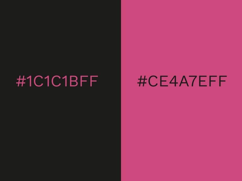
Try out Nebulosity and Pink Yarrow to add one of the most contrasting color combinations to your design. Nebulosity provides a daring dive into an endless black abyss, whereas Pink Yarrow is the exact opposite, bursting forth in all its unabashed pink glory.
When using this color combination for clothing, you don’t want to overdo it, as too much pink and black could potentially look tacky. However, in graphic design, it can look amazing.
Pink on its own can sometimes appear overly girly, but alongside black, it gets toned down by just the right amount.
Blue Atoll (#00B1D2FF) and Vibrant Yellow (#FDDB27FF)
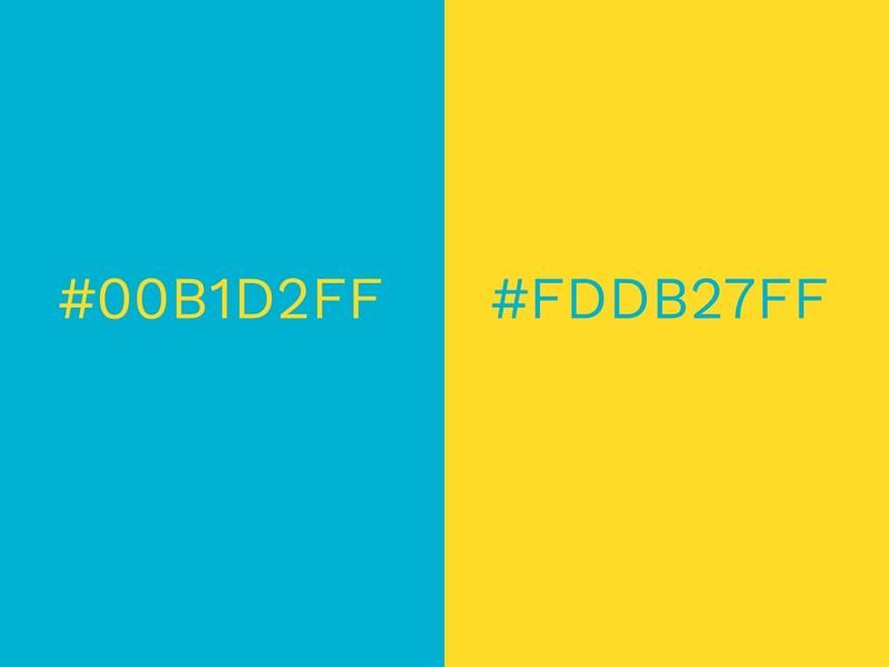
Feast your eyes on this electric summer color combo. Vibrant Yellow shocks the senses alongside the equally electric Blue Atoll.
It’s one of those color combinations that are just perfect for parties and casual events. It helps build excitement and imbues a design with purpose and energy.
These bright colors make a room look active and alive, but be wary that it may be too bright for when you want to relax in a smaller space.
Lime Green (#79C000FF) and Orange (#FF7F41FF)
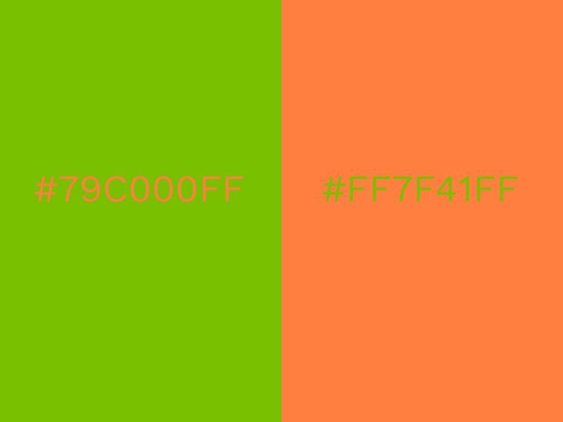
Two-thirds of the Irish tricolor combine here to create one of those color combinations that have an instant impact on the senses. Orange is loud and lime green is intense, but they can work well together when combined with each other.
There is a somewhat tropical vibe created from green and orange, reminiscent of an orange tree. Vivid colors are very trendy this year and lime green and orange could see a boost in popularity because of that.
If the combination of lime green and orange is too much for you, it can be offset with a neutral trim.
Inca Gold (#BD7F37FF) and Scarlet Sage (#A13941FF)
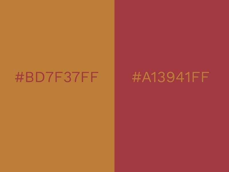
Gold is typically a symbol of wealth and luxury, and because of this, it is rarely used in a reserved manner. However, Inca Gold is a muted shade of gold that creates a more humble vibe. Scarlet Sage enhances the visual effect of this combo with its sleek red tone.
If you want a gold and red combo that’s less lavish than usual, this is the way to go. Both colors are warm at heart and will enliven any room or piece of clothing that they feature in.
Red and gold also manage to be attractive and elegant in a certain old-fashioned way that exudes class and sophistication.
Pale Lilac (#E3C9CEFF) and Lime Green (#9FC131FF)
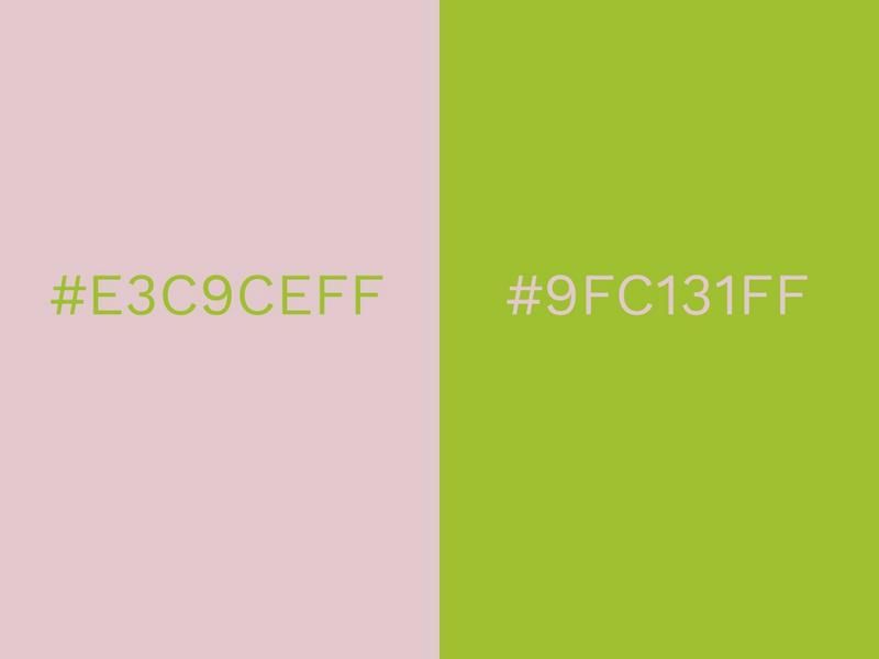
When looking for slightly alternative color combinations, Pale Lilac and lime green can be a solid solution.
Pale Lilac is youthful and soft, while this tint of green appears healthy and awake. Lilac communicates tenderness and makes a room more relaxing. It’s crucial that a pale pink is used here, as both a vivid pink and green could come across as garnish.
Lime green adds to the color combination by adding a refreshing, vintage flavor. When seen together, Pale Lilac and lime green make for a delightfully retro color scheme.
Dark Blue (#00239CFF) and Red (#E10600FF)
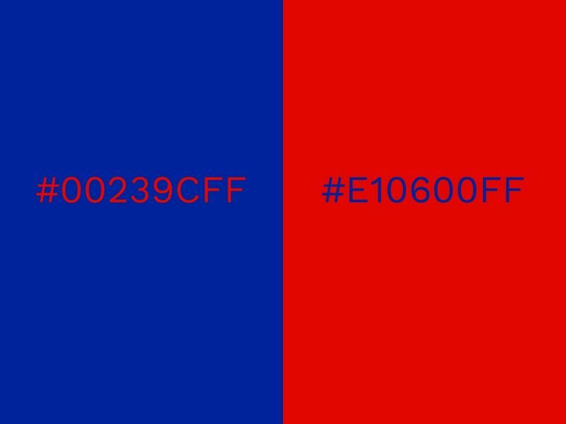
Blue meets red here in a clash of water and fire. The calmness, trustworthiness, and security of blue combine with the volatility, passion, and danger of red to create a potent mix.
It’s a color combination that has proven itself to be consistently reliable for many years. Both colors work well together in the logos of many famous companies and organizations, such as Pepsi, Domino’s Pizza, the NFL, and MLB.
It’s also featured in the U.S. flag, the British flag, the Russian flag, the Australian flag, and the Dutch flag. While the common denominator here might be the inclusion of white alongside red and blue, it is undeniably a highly effective color combination.
Color Matching with Three Colors
Having a variety of color ideas can be extremely useful when trying to be stylish in whichever area you need some color. That said, the more colors you add, the bigger chance it has of going wrong.
‘Good things come in threes’ rings true in this case, as there’s a fantastic array of color combinations to choose from. Three colors can combine to create striking logos, stunning interior design, dazzling dresses, and much more.
Living Coral (#FC766AFF), Storm Gray (#B0B8B4FF) and Forest Biome (#184A45FF)
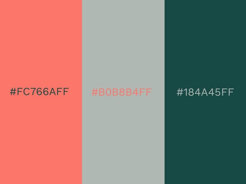
The dark clouds of Storm Gray form a gorgeous cover when hovering over Living Coral and Forest Biome. It’s a refreshing blend of colors that has a lush and inviting aesthetic.
This color combination is adventurous, yet mellow and slightly reserved. It would be a fantastic color scheme for a website to use, as it looks modern and is easy to engage with.
Living Coral, as it typically does, enlivens the color combination a great deal. Gray and green on their own would have a completely different feel. A modern color palette like this example can be versatile in its uses, so start designing now.
Blazing Orange (#FFA351FF), Buff Orange (#FFBE7BFF) and Yellow Cream (#EED971FF)
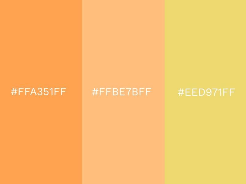
Boost your energy with this perky color combination. Blazing Orange is as lively as a color can come and it’s complemented excellently by the more modest Buff Orange and Yellow Cream.
The three colors can form a stunning gradient when placed alongside each other, resulting in a glorious summer look.
It’s a warm, fun color combo that would bring some additional brightness to the interior of a home. It gives an uplifting feeling that makes you feel more comfortable and at ease with your surroundings.
Sagebrush Green (#567572FF), Marsala (#964F4CFF) and Granite Gray (#696667FF)
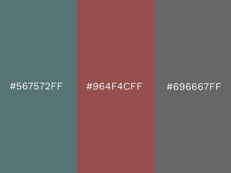
Marsala, the 2015 Pantone Color of the Year, is featured here alongside Sagebrush Green and Granite Gray.
Marsala is a warm, universal shade of color that can be used in a variety of ways. Whether it’s interior design, fashion, or beauty products, Marsala manages to be stylish across all mediums.
Sagebrush Green and Granite Gray offer a stunning contrast to the warmth of Marsala with their cool, earthy shades. If you think a dark color palette would suit your needs, this combination hits all the right visual spots.
Red (#DA291CFF), Norse Blue (#56A8CBFF) and Light Green (#53A567FF)
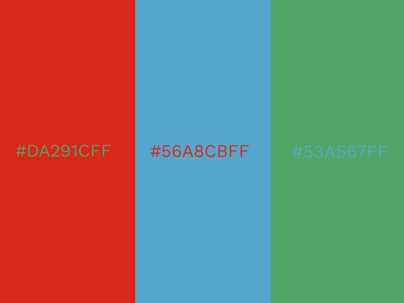
Red, green and blue are what many would consider three of the four primary colors, but they also create a superb color combination.
Google has had great success using these three colors as part of its branding and the color harmony they achieve is often unrivaled.
With red, you have an attention trigger to draw people in, with Norse Blue, you get calm and focus, and with light green, you get an attractive, but not overbearing, mediator.
Light Purple (#D7A9E3FF), Light Blue (#8BBEE8FF) and Light Green (#A8D5BAFF)
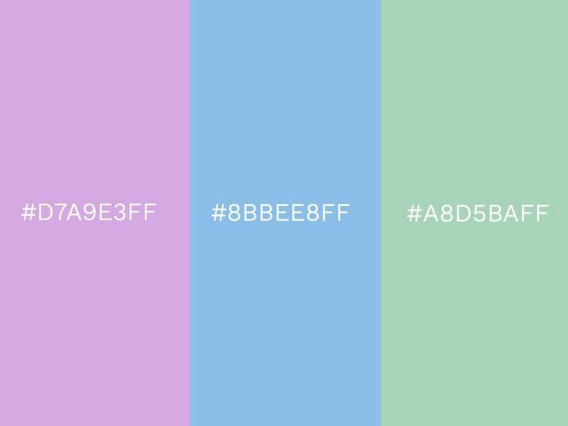
Watch out for the charge of the light brigade as light purple, light blue, and light green take center stage. These stylish tints make for a superb color combination that has the ability to be loud and colorful without being intrusive and gaudy.
When combined together, they deliver a gorgeous ensemble of soft, approachable colors. You could potentially create a very relaxing, trendy interior space by using this color combo.
There’s something very peaceful about these colors that makes them easy to engage with. They are slightly childlike too, which would make them a great choice for decorating a child’s room.
Grass Green (#7DB46CFF), Lightest Sky (#E7EBE0FF) and Clearwater (#ABD6DFFF)
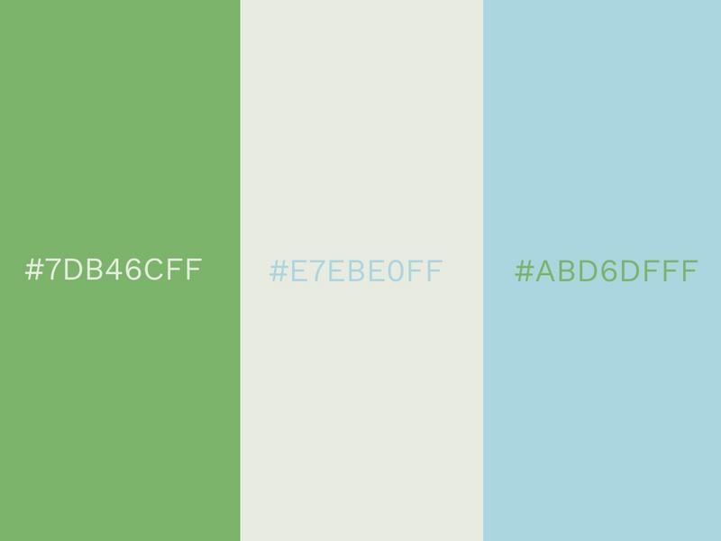
The delicately soft Lightest Sky is placed between the lush Grass Green and the refreshing Clearwater. We can imagine an image of crystal clear lake water lapping against a green shore with an open sky stretching far into the distance above it.
It’s one of those invigorating, clean color combinations that are extremely pleasant and inoffensive to look at. This trio could look beautiful in the interior of your home and can help put a smile on the face of your guests with their cheery vibe.
Green, white and blue all give off an aura of purity and calm and ensures that they mix together so effortlessly.
Radiant Yellow (#F9A12EFF), Living Coral (#FC766AFF) and Purple (#9B4A97FF)
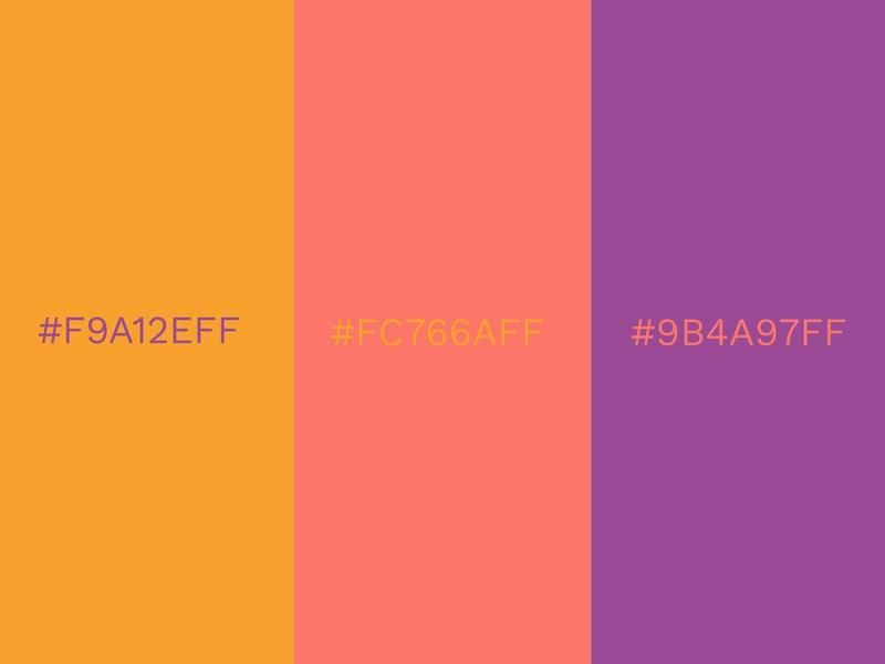
The combination of Radiant Yellow, Living Coral, and purple makes you feel warm and toasty by just looking at it! It’s almost as if the glowing summer sun is setting before your eyes.
It inspires optimism about the future and a sense of playful expression that has the potential to uplift any design it features.
Radiant Yellow is reminiscent of a mango or some other succulent tropical fruit and is a really strong shade of yellow.
Alongside Living Coral and purple, it makes for a really modern color combination.
Warm Gray (#A59C94FF), Crimson (#AE0E36FF) and Raspberry (#D32E5EFF)
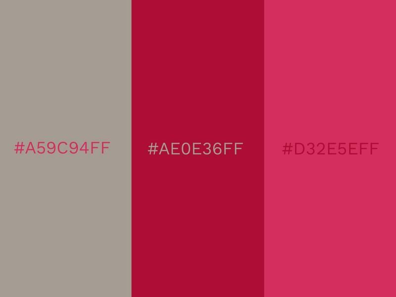
The words ‘warm’ and ‘gray’ are not ones that you would typically associate with each other, but the unique Warm Gray defies the rules.
There’s nearly a hint of brown lurking behind the darker exterior and this results in a gray that is far more welcoming and amiable than usual.
Crimson and Raspberry enhance the Warm Gray with their vivacious colorations. When seen together, the trio is one of the most cultivated color combinations.
White (#FCF6F5FF), Pink Lady (#EDC2D8FF) and Sky Blue (#8ABAD3FF)
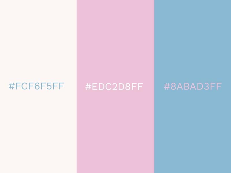
White is combined here with the gentle colors of Pink Lady and Sky Blue. It’s a soft, feminine color combination that is symbolic of new life and youth.
A clean palette such as this one can be thoroughly re-invigorating. There’s almost a fragrance to it that transcends the page or the screen. The combination of white, Pink Lady, and Sky Blue can make for some stunning interior design and looks great on clothing.
Due to its light and innocent appearance, it is often used as a symbol of purity. This can be seen in the color scheme of Evian, who sells their water as a natural product.
Living Coral (#FC766AFF), Spiced Apple (#783937FF) and Peach (#F1AC88FF)
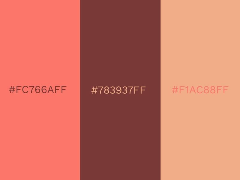
The 2019 Color of the Year features again here alongside the splendid Spiced Apple and a placid peach.
It’s a tender, caring color combination that would make an interesting palette for social media sites such as Instagram. Once the post creation is done directly add it to an Instagram post scheduler and schedule them at your preferred timings.
The coziness of the three colors also makes them a good fit for a living room. Brown and peach are two colors that really contribute to a wholesome, healthy vibe.
Lemon Verbena (#F6EA7BFF), Orange Pop (#FFBA52FF) and Aurora Pink (#E683A9FF)
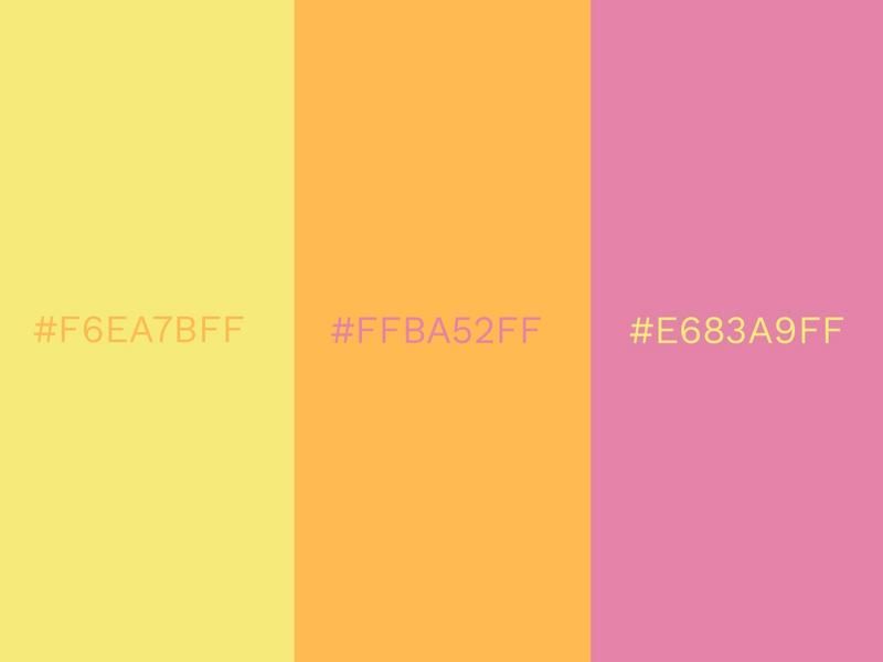
Embrace the delightfully fruity color combo of Lemon Verbena, Orange Pop, and Aurora Pink. It’s one of those color combos that work really well for a summer setting.
It is also reminiscent of some of the commonly used colors of highlighter pens, which is a testament to its eye-catching nature. Depending on how it’s used, this color combination can be as vibrant as it is mellow.
Yellow, orange, and pink can be a superb theme for your wedding colors. It’s cheery, bright, and light-hearted, ensuring that your big day is full of fun.
Red (#F65058FF), Yellow (#FBDE44FF) and Navy (#28334AFF)
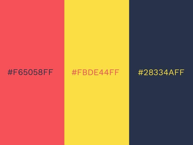
In this color scheme, we see the classic primary combination of red, yellow, and blue. While navy is used here instead of a more traditional blue, it is easy to see why this is one of the most popular color combinations.
The Romanian flag features all three colors, where they represent fraternity, justice, and liberty. However, these colors can be used in a wide variety of designs and they can have a whole host of different meanings.
Each color in this combination complements the others nicely and none of them outshines the other.
Tanager Turquoise (#95DBE5FF), Teal Blue (#078282FF) and Kelly Green (#339E66FF)
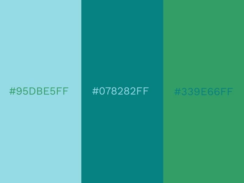
Tanager Turquoise, Teal Blue, and Kelly Green combine to create a cool, fresh color combination.
It’s essentially the mixture of a sky blue, an aquatic green, and a leafy green, which are the colors of some of the key components of the natural environment around us. As a result, this color combination is a great choice for an environmentally conscious design.
Green is one of the best choices for using as a background color. We are so accustomed to seeing green in the world around us and because of that, this is one of the most unobtrusive color combinations you can find.
Windsor Wine (#643E46FF), Scarlet (#BA0020FF) and Bright Red (#EE2737FF)
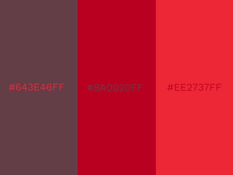
This heated color combination helps give a fiery warmth to any canvas that it’s used on.
The deep Windsor Wine is a classy, elegant companion to the more youthful and vibrant Scarlet and Bright Red. On a cold winter’s day, walking into a room that’s decorated with these three colors is sure to have an uplifting effect.
Red has a focusing effect and we tend to concentrate better with red around us. Many brands use varying shades of red in their logos or call-to-actions to grab people’s attention.
Knockout Pink (#FF3EA5FF), Safety Yellow (#EDFF00FF) and Out of the Blue (#00A4CCFF)
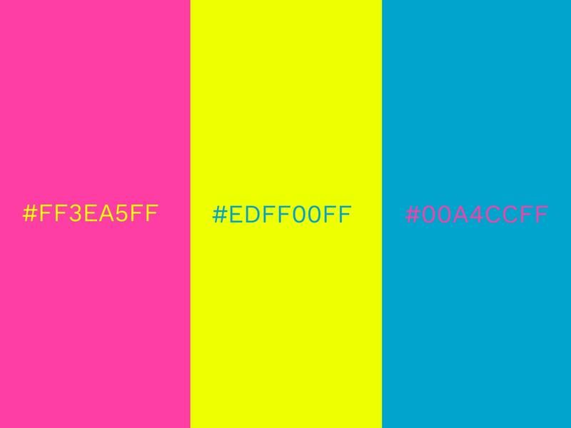
2021 saw the popularity of vivid colors to rise and Knockout Pink, Safety Yellow, and Out of the Blue is one of the most vivid color combinations.
Neon signs, strobe lights, glow paint; disco fever has truly taken hold in this color palette. If you want to create a design that is full of energy and demands attention, then this color combination is the way to go.
However, some color combinations aren’t suitable for every situation and if you decide to use these unique colors in the interior of your home, you might struggle to get to sleep! Vibrant colors can be used as a marketing tool to catch your viewer’s eyes.
Puffin’s Bill (#E95C20FF), Green (#006747FF) and Brown (#4F2C1DFF)
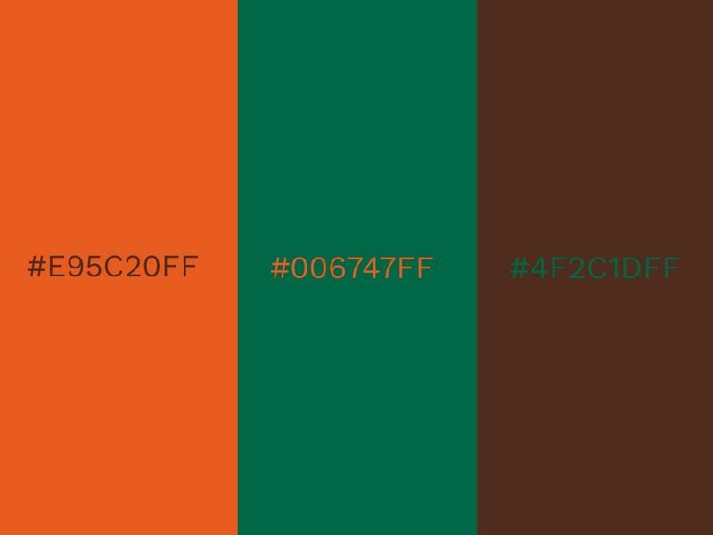
Here we see a thoroughly earthy and natural compilation of colors. Puffin’s Bill is aptly named after the bill of the famous island bird, and with color combinations as rich and vivid as this one, you can almost picture a puffin making its nest upon a brown cliff dotted with lush green plant life.
Puffin’s Bill is a typical orange shade that emanates positivity and enthusiasm, bringing a great deal of warmth to this color combination.
Brown and green are two of the most natural-looking colors and their symbolism of growth and renewal really shines through here.
Danger Red (#D9514EFF), Tap Shoe (#2A2B2DFF) and Blue Blossom (#2DA8D8FF)
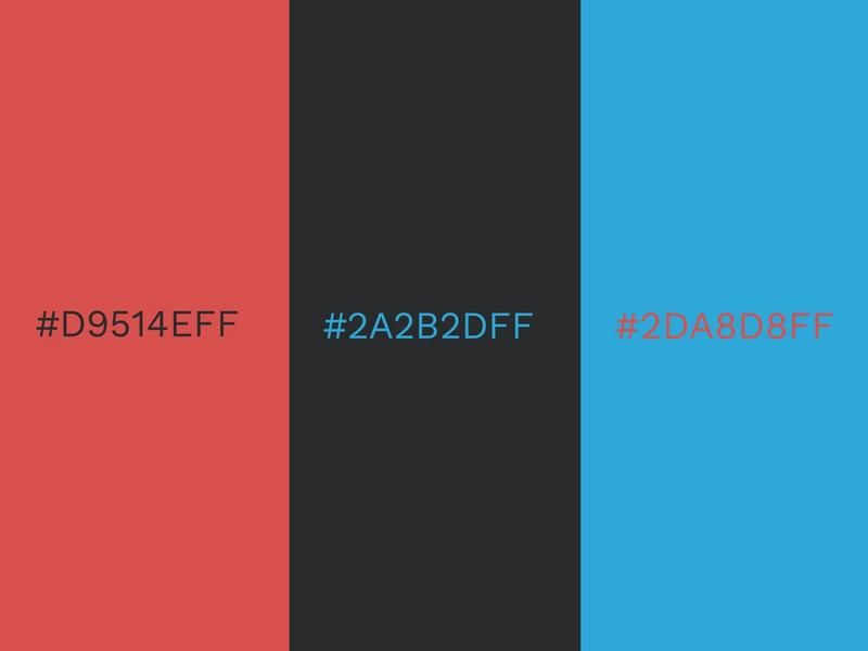
When red and black are combined, they often represent a villain or an enemy of some sort. However, in this color combination, Danger Red and Tap Shoe are tamed by the presence of Blue Blossom.
Blue Blossom offers a calming, peaceful companion and completely changes the dynamic of the color combination.
Depending on how you use it, the light blue can really pop against a red and black background. Such a noticeable contrast between dark and light colors can be fantastic for creating effective CTAs.
Colors That Go Together in Fours
Sometimes you might need more than two or three colors in your color combination. That’s where these mixtures of four colors come into play. These intricate color schemes are perfect for many different purposes, from social media themes, birthday cards to interior design. With Design Wizard, you can mock-up designs or ideas on a template of your choice. Use the color picker to add these combinations below or feel free to create your own palette.
Bright Violet (#963CBDFF), Living Coral (#FF6F61FF), Vibrant Pink (#C5299BFF) and Marigold (#FEAE51FF)
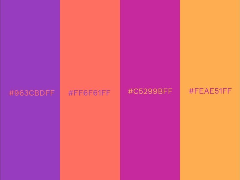
This color combination is a superb palette to use for social media. It’s warm, vivid, and has a youthful vibe.
The presence of Living Coral ensures that this is one of the trendiest color combinations around too. These colors inspire fun and help bring about joy when you view them.
The vibrancy of these colors will be excellent for getting engagement on social media, where eye-catching colors will be all the rage this year.
White (#FCF6F5FF), Vanilla Custard (#F0E1B9FF), Goldfinch (#F3DB74FF) and Scarlet Sage (#A13941FF)
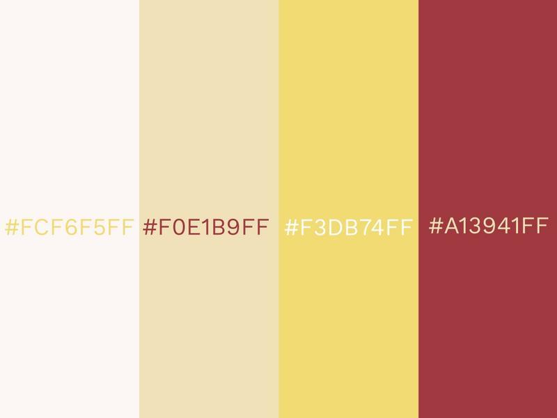
Brighten up your day and your design with a splash of these colors. It’s one of those color combinations that instantly brings to mind images of a warm, summer morning.
It radiates a pleasant summer energy that makes it ideal for seasonal designs that are created at that time of year. Goldfinch, Vanilla Custard, and white act as a gradient of sorts, and interspersing these three colors with a strong red create a delightful contrast.
Using this color combination in your home can create an uplifting aura that lightens the mood and promotes comfort.
Deep Blue (#2460A7FF), Northern Sky (#85B3D1FF), Baby Blue (#B3C7D6FF) and Coffee (#D9B48FFF)
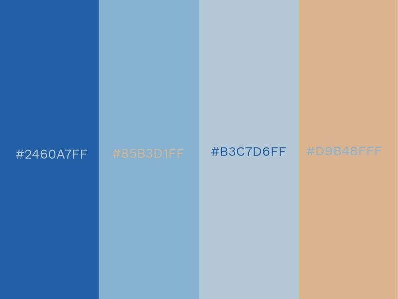
This blue color palette with an earthy brown coffee color is calming in nature and can be used in a wide variety of scenarios. Color harmony is on display here with a mixture of multiple shades of blue and an uplifting taste of coffee. Picture the steam wafting from a fresh cappuccino as you lie back and watch the waves roll in.
This toned-down color scheme is extremely flexible and can be used in so many different situations. Instead of bombarding the senses, it soothes them.
Vivid colors were popular in 2021, but there was undoubtedly be a counter-movement for more muted color combinations being used too.
Habañero Gold (#FFD653FF), Dijon (#DDB65DFF), Honey (#EEB238FF) and Chestnut (#6E4C1EFF)
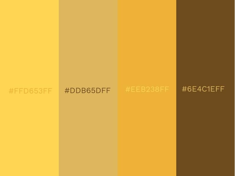
Savor this exquisite color mixture that blends together Habañero Gold, Dijon, Honey, and Chestnut.
Sumptuous Habañero Gold is a fitting bedfellow for the welcoming and cheerful Honey. Not all golds and yellows will go together, but this color combination creates a stunning summer look. Dijon and Chestnut provide some reassuring support for their more boisterous partners.
This color combination could also be considered an autumnal shade, being reminiscent of falling leaves from a deciduous tree. Gold is often considered a color of wealth and excess, but it can also be reassuring and is sometimes associated with wisdom.
Delphinium Blue (#669DB3FF), White (#F0F6F7FF), Atmosphere (#A89C94FF) and Fiery Coral (#FF4F58FF)
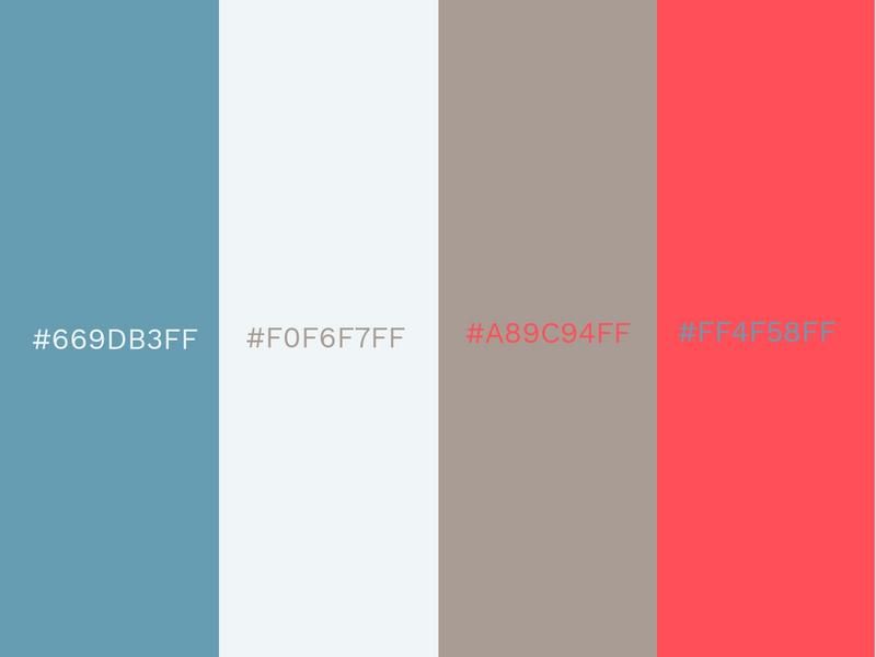
Delphinium Blue, white, Atmosphere, and Fiery Coral make for a clean, modern-looking color combination.
Since Living Coral continued to be hugely popular in 2021, other shades of coral experienced a boost too. Fiery Coral is slightly darker than Living Coral but just as vivacious.
If you prefer minimalistic designs, but want to add a slight pop of color, this is the perfect combination for you. Fiery Coral could be added for a font color while your background remains more toned down.
Dark Green (#0A5E2AFF), Light Green (#6DAC4FFF), Star White (#EFEFE8FF) and Red (#FE0000FF)
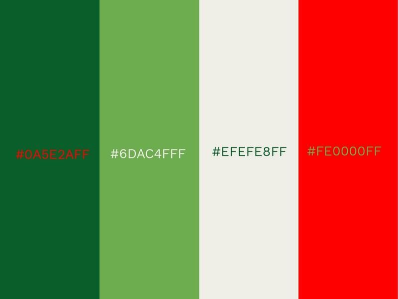
Light green and Star White form a barrier between the harmonious dark green and a vigorous red.
The red pops off the greens in this color combination really well. Placing this red over a green background ensures that whatever message you want to communicate is easily seen. Light colors like these shades can be matched with darker choices to create an interesting visual contrast.
Heineken and Carlsberg are two popular brands that use color combinations similar to these in their advertising. And with the help of the photo color editor you can make those colors even brighter.
Soft Pink (#FFDDE2FF), Peach Amber (#FAA094FF), Yucca (#9ED9CCFF) and Arbor Green (#008C76FF)
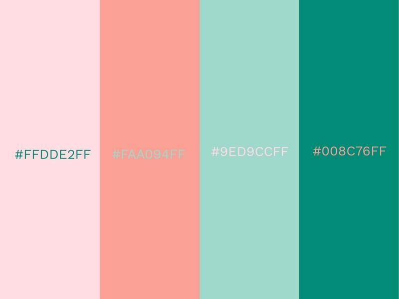
When it comes to relaxing color combinations, this selection of refreshing pinks and greens hits the right note. It’s calm, but also energizing.
Soft Pink and Peach Amber are two very welcoming and approachable colors that are complemented by the serene turquoise color of Yucca and the darker Arbor Green.
This color combination has the potential to create a distinctly feminine feel in any space where it is utilized.
Purple (#93385FFF), Lilac (#9F6B99FF), Petunia (#4F3466FF) and Aubergine Gleam (#301728FF)
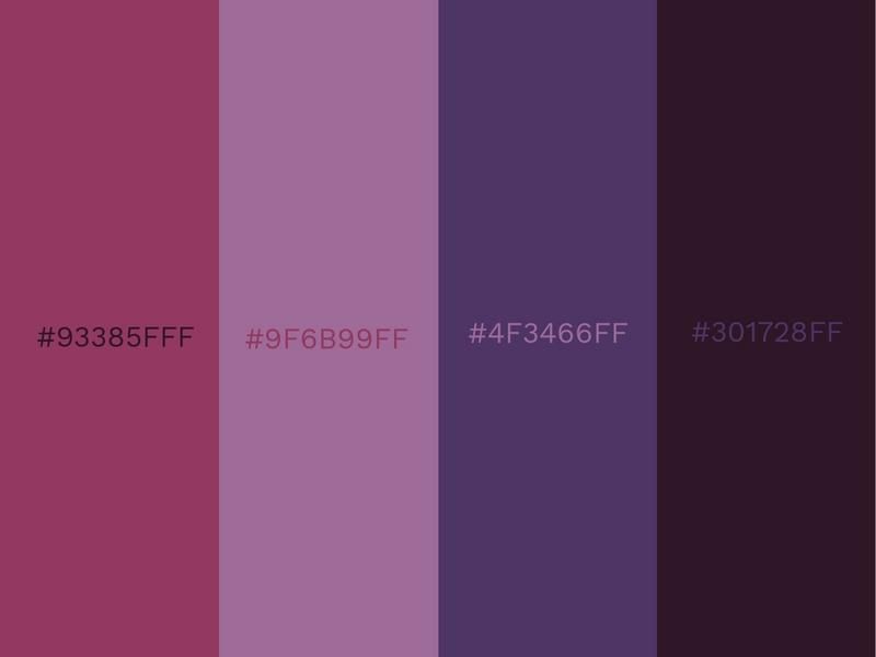
Explore many shades of purple with this vivid color combination. Aubergine Gleam offers a rich, dark shade that flows nicely into the lighter petunia. Combining all four colors together in a design could be used to make really nice gradient.
This ascending series of purples can be used to create exhilarating designs that demand attention. Nighttime scenes can be reinvigorated through this palette.
Despite their vibrant nature, these purples could be great for a less energetic setting too. Think exquisite multi-colored fabric or a peaceful galactic-themed design.
White (#F1F3FFFF), Light Pink (#F7CED7FF), Pink (#F99FC9FF) and Dark Pink (#EF6079FF)
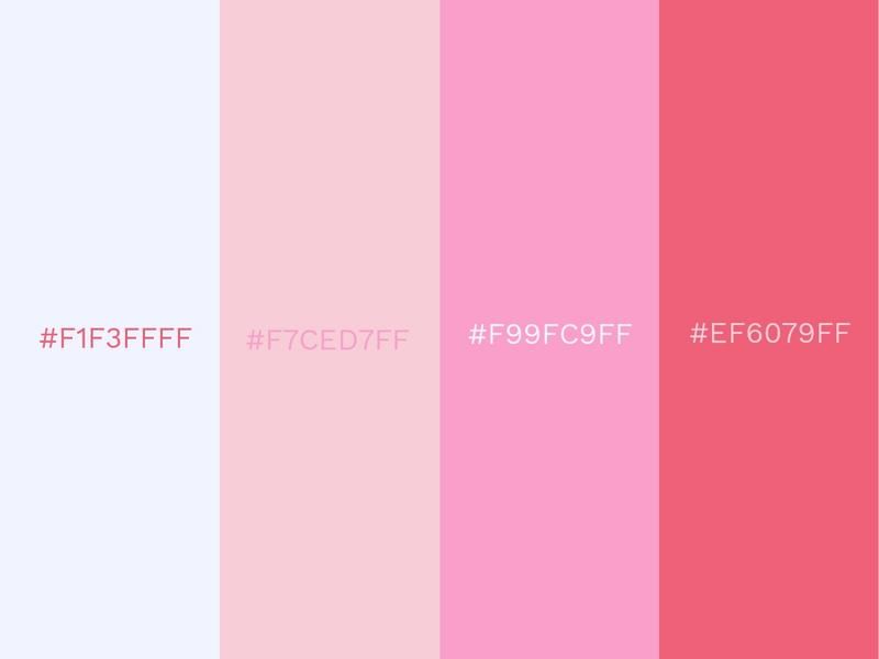
Create a cool gradient with white, light pink, pink, and dark pink. The various pinks and the white join together to form a beautifully feminine color combination.
The pinks aren’t too loud, so they don’t come across as overly girly and retain a certain element of sophistication and maturity. Use light colors to create a comfortable and appealing atmosphere for a viewer.
Living up to the expression ‘tickled pink’, this color combination creates a happy and joyful vibe wherever it is used.
Blue Sky (#ABD1C9FF), Elation (#DFDCE5FF), Nugget (#DBB04AFF) and Celestial (#97B3D0FF)
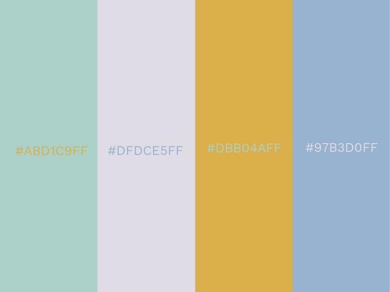
Part of the shapeshifter palette from Sherwin-Williams, these four colors contribute to a classy and stylish combination. The muted pastels and deep blues are inspired by healing energy and spiritualism.
Each color gently complements each other, bringing a peaceful atmosphere to a room or a design. The colors of shapeshifter are non-intrusive and have a welcoming aura to them.
They don’t assault the senses and could never be accused of being garish. Elation is a superb neutral option and can be easily combined with so many different colors.
Desert Sand (#DBBEA1FF) Burnished Brown (#A37B73FF) Old Burgundy (#3E282BFF) and Mystic (#D34F73FF)
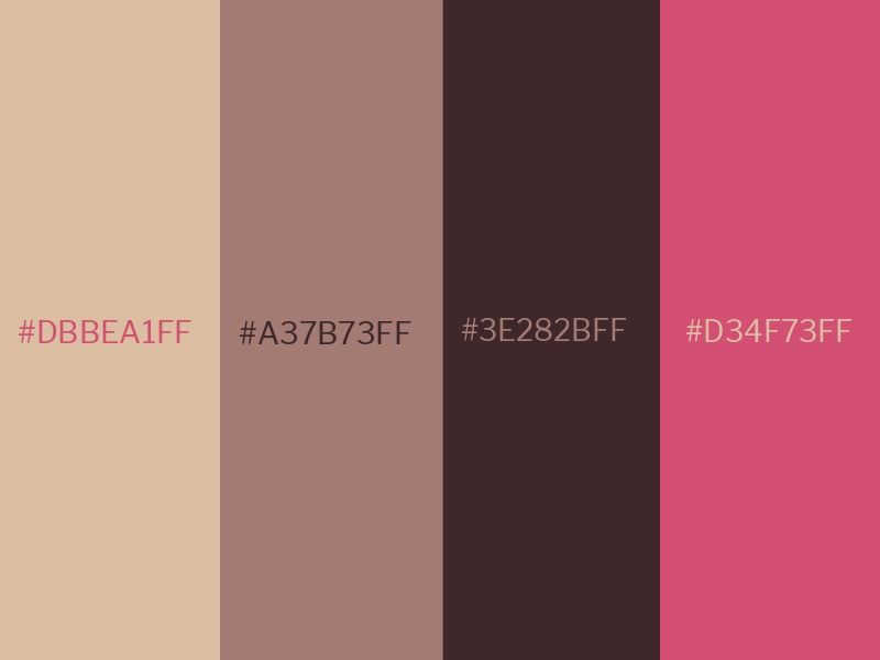
This combination of cool colors creates a retro and nostalgic feeling. These feelings are powerful tools to connect with your audience, for business purposes.
The color Mystic adds a vibrant punch that elevates this color palette. A combination of these four colors has endless possibilities for use. Interior-wise, a room that encompasses these colors will be warm but incredibly modern. Walls with a mixture of these colors can be matched with classic armchairs, oval mirrors, and refurbished objects from the past.
In terms of design, you can create templates with Design Wizard and utilize these unique colors.
Vermilion (#E3170AFF) Celadon (#A9E5BBFF) Medium Champagne (#FCF6B1FF) and Honey Yellow (#F7B32BFF)
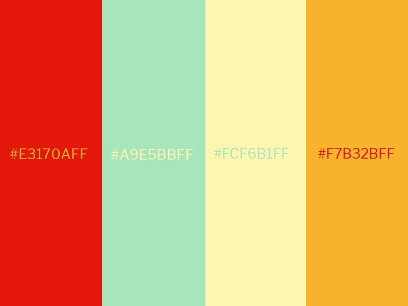
Each of these colors works well when used alone, but sometimes a combination can really make colors shine brighter. This is the case with these four colors. Celadon and Medium Champagne can act as a base when using these colors.
They are neutral and light tones that are unassuming. For a design, Vermillion and Honey Yellow could be used interchangeably on font, borders, text boxes, and more. They could also be layered over each other in these design elements.
You can create layers within Design Wizard to create a visual hierarchy. Make sure not to overpower your design with the shades of red and yellow, as they may distract the true message you are trying to get across.
Sapphire (#2E5266FF) Light Slate Gray (#6E8898FF) Cadet Gray (#9FB1BCFF) and American Silver (#D3D0CBFF)
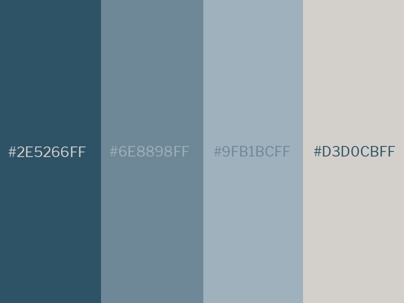
These cool colors are perfect for a sleek, modern interior design that can be matched with silver mirrors, frames, and ornaments. Make sure that your house is getting enough light through the windows, possibly large, slidable ones. Use yellow furniture to add vibrancy against these colors.
Gray is a color of neutrality, being a mixture of black and white. Gray can also suggest negative connotations like loss, so it is important to use as much color elsewhere so this combination doesn’t become a source of gloom.
However, there is a reason why these shades work so well together. It’s a classic color combination.
Red Crayola (#ED254EFF) Naples Yellow (#F9DC5CFF) Mint Cream (#F4FFFDFF) and Oxford Blue (#011936FF)
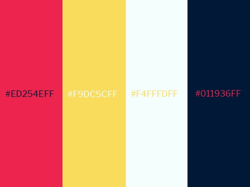
Red Crayola is a toned-down shade of red, that still offers symbols of passion and power. To add elements of light and dark, Mint Cream and Oxford Blue work beautifully, creating a modern contrast.
Utilizing contrasting colors can be very effective in creating interest, but it’s a tool that should be in moderation. The addition of Naples Yellow doesn’t overpower the combination like a brighter shade of yellow would. Instead, it adds a mature optimistic feeling.
If you’re feeling optimistic about using this combination, start experimenting on Design Wizard.
Trending Color Palettes
Following the shaky and unfortunate year 2021 turned out to be with COVID 19, we were likely to see the impact of what was a tough year for so many. Considering how tough and worrying time it was for so many, we are likely to see color trends try and counteract the mood with lots of warm serene color hues, and pastel color palettes also, to create calmness within the home, and within brands. We will continue to see brighter colors gain popularity. This will be important in adding some cheerfulness to our lives. Combinations of warm and calming palettes with a nice bright color to pop are sure to become a common occurrence. Later in the year, a dark color palette may start to weave into branding and advertising to match fall and winter aesthetics.
Logo Color Combinations
Popular uses of combining colors feature logos. Logos are instantly recognizable by what colors are prominent. Color psychology and symbolism are highly important to take note of when designing a logo. After all, this is one of the first visual pieces that someone will see of your brand. Check out our How to Design a Logo blog for more great templates that incorporate trendy color combos. All designs are editable in Design Wizard, which means you can add your own brand colors or your own text. Keep in mind that the color choices should make sense for your business and target audience.
Ready to Make Your Own Color Palette?
Now that you’ve read through our list of the top 80 coolest color combinations, it’s time to decide how you’re going to use these color schemes! Maybe you’re trying to create a brand logo, redesign a website, design a social media post, pick a new dress, or painting your wall. Whatever you’re creating, we hope that this list has given you the inspiration you need to choose the most suitable colors.
Make sure to sample these color combinations on a customizable template in Design Wizard. All you have to do is copy the accompanying hex code into the custom color palette in the app and your template will be transformed immediately. Add text to your designs to create stunning branded content.

Briona Gallagher
Briona Gallagher is a Product Manager. With a background in Fine Art, Design and Journalism, she has a demonstrated history in all areas of visual and written communication. Her favourite design tools are Background Remover and Moodboard Maker templates - "They make life easier" - as she likes to say.