What is the hierarchy in design?
Understanding the visual hierarchy in design can put more of a structure on your design process, essentially leading to better design. People are visual creatures. When looking at a web page, a piece of marketing material, an ad, or anything design-related, their eyes gravitate toward the visual elements. Enter the concept of visual hierarchy.

Visual hierarchy, simply put, is a set of principles that ultimately helps you layout the visual pieces of your design puzzle. There is a hierarchy of visual elements to keep in mind.
Let’s say you have this terrific idea for an ad. Upon creating the ad, your scale is off. This impacts the scanning pattern of your audience and already, you’ve failed to take into account one of the basic visual hierarchy principles. The images fight against one another, your ad falls flat.
Table of contents:
- ● What is the hierarchy in design?
- ● Eye Movement: Visual Reading Patterns
- ● A Visual Hierarchy Guide – Some Ground Rules
- 1. Color in Visual Design Hierarchy
- ● Group Colors According to Color Wheel
- 2. Scale in the Visual Hierarchy
- ● Scale Equals Visual Balance
- 3. Shapes in Your Visual Design
- ● Why Shapes Are So Important in Visual Design & Hierarchy
- 4. Negative Space as Part of an Effective Visual Hierarchy
- ● Use Negative Space Strategically For Visual Impact
- 5. Alignment and Hierarchy
- ● Text and Image Content Can Have Different Alignments
- 6. Repetition Should be Part of the Visual Hierarchy
- ● Repetition Does Not Equal Visual Monotony
- 7. Proximity within the Hierarchy of Design
- ● Proximity Leads to Structural Integrity
- 8. The Hierarchy & Font Style
- ● Word Placement Can Also Add to Graphic Design
- 9. Composition as a Central Principle of Visual Hierarchy
- ● Rule of Thirds In Design
- 10. How Motion Factors into Visual Hierarchy
- ● Motion Can Be Multi-Dimensional
Eye Movement: Visual Reading Patterns
When people read land on a website, one of two things happen. They stay and consume the content, or they bounce. But before either of these two things occur, something else happens, and it involves the visual hierarch in your design. They scan the page. When people scan the page it usually takes place in the form of a Z pattern or F pattern. These visual patterns are crucial to knowing what to put where in design.
When thinking about the elements of your page and the hierarchy, you need to take into account the visual aspects people consume at first glance. If you master this, you master visual hierarchy in your design and will be rewarded with more attention and engagement.
Design whatever it is you are designing, with the knowledge that people will first scan certain areas before others, ensure your logo is placed in the right spot so your branding doesn’t get missed. Include headlines, subheadings, information, and other important elements in all the right places.
How you line things up, what order you place images, the scale of those images, the way colors interact— all need to be key concepts you consider when thinking about how people scan a page visually. By following the “rules” of these design elements of the visual hierarchy, it will make your result much more compelling and complement the scanning patterns of your audience.
A Visual Hierarchy Guide – Some Ground Rules

Whether you’re an amateur designer or a seasoned veteran you can always use a refresher when it comes to visual layouts and placing elements in the design – perhaps a call to action. Are you maximizing negative space—a question you might not have thought to ask. Are you taking into account what you want the audience to notice first? Second? Third? Is the key image at the forefront? Getting the important information across using visual understanding needs careful consideration of these elements. Below are ten crucial components of visual design as relating to this idea of visual hierarchy.
1. Color in Visual Design Hierarchy
Who doesn’t love bold pops of bright color, right? Color is one of the main attractions and visual elements of your design, be it for a landing page or brochure. Therefore, it’s sitting pretty high up in the hierarchy of visual elements. Done correctly it draws attention. Done incorrectly and you can deter people. Just splattering bright colors all over the page to grab attention may be a bit discordant.
We all want our designs and ads to stand out from the crowd, but what makes one ad work more effectively than another? The power of color. Harness this power by using eye-catching color combinations for ads.
Life is all about balance – and so is the hierarchy. Too much of anything is never a good thing. Using contrast smartly can make key elements stand out. For example, red is a color most commonly associated with passion and energy. However, if it is lost in a sea of other bold colors, it isn’t going to have the same visual impact. Setting something vibrantly red against a monochromatic and more muted backdrop will have a huge effect.
Also, using colors from a similar palette grouped can go a long way toward highlighting the main feature of a webpage for example.
Group Colors According to Color Wheel
Keep the warmer colors together for maximum effect. And by the same token, group those cooler colors—the blues, greens, and purples. This makes reading the or advertisement far easier (and more enjoyable) on the eyes.
2. Scale in the Visual Hierarchy
Right after color in the hierarchy, perhaps one of the most important elements in visual design: scale. Here’s the scenario, you have a fairly large image in the design. You then pair it with something that is supposed to play off of that image and yet the scale is wrong. The result: a pretty awkward rendering. You can use the golden ratio in design to ensure the scale of your design is on point.
As the saying goes, the bigger the better. And often in visual and graphic design, this is true. Bigger elements stand out and grab the audience’s attention, without question. But…if all other elements within that design are way off base in terms of scale, the impact of that central large object is significantly lessened.
It takes time to develop an understanding of how visual hierarchy plays into your design. Creating the perfect scale can be one of the trickier aspects to manage, but it will be integral to having a truly effective result.
Scale Equals Visual Balance
And balance is what the eye craves. Even if the audience cannot pinpoint exactly what may be wrong, if it’s off-balance they will sense it. Pay attention to your scale! Any single element can have a negative visual impact if not scaled properly.
3. Shapes in Your Visual Design
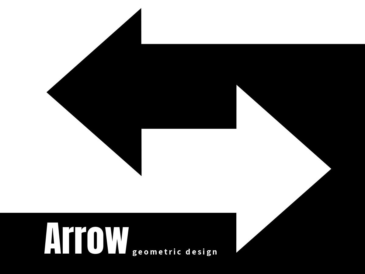
Shapes, much like colors, have certain associated connotations. Think about the heart shape and what it consequently has come to mean. Basic shapes often pack a powerful punch in terms of visual design. And versus text, shapes can get your meaning across far more effectively.
This is why you want to think about which shapes you incorporate and how you are using them. Also, consider this, the world is becoming increasingly globalized. That means that your message, your visual design is apt to reach people who may not speak your language. What then can you convey through shapes? This is an important and powerful element of the hierarchy.
Grouping like shapes is also a great way to establish a more powerful visual hierarchy within the design. Like shapes somehow connected will draw in the user’s eye. Once you have their attention, what will you say?
Why Shapes Are So Important in Visual Design & Hierarchy
Photos are a great visual asset in any design. The use of color is fantastic. But with shapes, you can get perhaps even more creative. Shapes also give you the flexibility to differentiate certain texts and/or features of a webpage.
4. Negative Space as Part of an Effective Visual Hierarchy
Sometimes less is more, especially in visual terms. The concrete elements of a design are easy to identify. Understanding the hierarchy is a little more difficult. Understanding effective ways to use color, lines, text, and images in terms of visual hierarchy is of course important. But what about negative space? Why should this be a part of your design scheme? What, if anything, does it add to it?
There is a great deal to be said for including white space in your design. Negative space helps to single an element out. And if that element is key, what better method of highlighting it. Also, the eyes like to have a breather. Especially if your page or flyer, what have you, has a ton of content on it, white space becomes essential.
If you try and simply cram a whole bunch of items within a frame, the audience is probably going to feel overwhelmed. Ultimately, they will refrain from viewing further.
Use Negative Space Strategically For Visual Impact
That is to say, there are ways that you can use negative space to direct the eye and create a positive visual impact. Get creative. Be savvy as far as what you’re suggesting the reader look at by having a white space strategy.
5. Alignment and Hierarchy

Alignment is so important. What this means is how elements are placed within the frame of the design. Very often you will see things aligned to the left. This is true of text especially. To this end, many designers will use left alignment.
However, you are not confined to the left. Centering text and images are also quite popular. Many people feel that by using a center alignment approach, there is more visual balance overall. You can of course think outside the box as well. But remember that you want the placement of elements to make sense.
When all is said and done, you want the user’s eyes to easily follow the sequence you’ve laid out. The last thing you want is for them to be jumping out of order across the page. They will lose the true essence of your message.
Text and Image Content Can Have Different Alignments
Some opt to align everything the same way. And this is fine. But don’t be afraid to mix it up from time to time. Text can be left-aligned for example, while images are grouped more in a center alignment style. It might make for an interesting effect and visual impact.
6. Repetition Should be Part of the Visual Hierarchy
Repetition lends itself to uniformity, and uniformity equals consistency. Depending on your brand, creating an aura of consistency could be key. As far as your design and the rules of visual hierarchy, using repetition effectively could help with the recognition factor.
As far as building a brand, what you want is for audiences to see something and recognize it as “you.” A pattern, a set of colors, certain graphic elements. Whatever part of the visual design it may be, you want them to link it to your brand.
Even something as simple as the repetition of a font in your design could spur them to identify with your brand. Don’t be afraid of repeating patterns; research has found that there is a certain sense of calm and reassurance that comes from repeating certain elements in graphic/web design.
Repetition Does Not Equal Visual Monotony
It could bring a whole new meaning to an element. Again, creativity counts here. How might you employ a series of repeating shapes, words, or colors to offer a bit of the unexpected?
7. Proximity within the Hierarchy of Design
Where elements appear in relation to one another is what is meant by proximity. So for instance, if elements are spaced apart on a page, the user is going to be apt to look at them separately. If however, they appear grouped in some way, the user will identify them as related.
You can do a lot with proximity which is why it is so important to establish visual hierarchy. Again, by separating certain components—say the text from images on the page—you signal that after viewing one, the audience should move on to the next.
And in grouping shapes close together, you are automatically drawing the eye to a certain message or visual moment.
Proximity Leads to Structural Integrity
By understanding how to effectively place images and text within the context of your visual design, you are adding structural integrity. And whether they realize it or not, structural integrity helps give your audience greater confidence in what you are promoting.
8. The Hierarchy & Font Style

Considering text is generally part of a visual design, it can make up a huge part of how your design is interpreted. It can impact the reading patterns of your audience. If the body copy of your design is built with a bland and boring, or illegible font, it can be detrimental to your design. Are you using a font that catches the eye? Is your font too complex or difficult to read in some way? When it comes to graphic design, certain go-to fonts seem to play better than others.
Cleaner lines and styles often work quite well. To stress a certain word or call to action, you might also modify the font style. For instance, let’s say there is a sale coming up. Any words associated with the promo you could always italicize, underline or put in boldface. The font size, whether it’s larger font or smaller font, the visual weight, or the font being italicized can help convey a greater sense of urgency or importance.
The typeface you utilize needs to be integrated well with all of the other elements on the page and/or the design. Again, it is important to understand the idea of visual hierarchy in body copy, and consequently how the various pieces play off of one another.
Word Placement Can Also Add to Graphic Design
The placement of any text can also help accentuate a certain word or phrase. To that end, also think about sizing text differently according to order of importance. Bigger font sizes connect to central ideas. The less important text is therefore made smaller. This can have huge value to your overall design and information when done right.
9. Composition as a Central Principle of Visual Hierarchy
Composition points to the overall organization and structure of your design. The way that everything gets laid out will ultimately help determine how in essence your audience “reads” through it. You, therefore, have a guiding hand in not only how they take the design in, but how they come to interpret it.
Leading lines can help your audience see the design in the way you intend. A leading line doesn’t have to be an actual line, rather anything that creates a sense of movement. As the phrase suggests, leading lines are elements that in some way naturally lead the eye in an overall direction across the page or screen.
Sometimes the path through your design isn’t all that obvious. You have to create that path. You have to offer signposts that say: “this is how I want you to take in the overall image in front of you.”
Rule of Thirds In Design
The Rule of Thirds is pretty standard fare for many graphic designers. What happens is that the design gets divided into thirds both horizontally and vertically. The focal points then ideally come in where four points intersect. Instead of putting the focal point smack dab in the center, you are making things a bit more interesting from an interpretative standpoint.
10. How Motion Factors into Visual Hierarchy
Motion cannot necessarily be used in printed designs—but nowadays more often than not, design is about a more interactive format. Graphic designers use movement in their work all the time to spur action.
Motion is also going to make any design more engaging. The user is at once taken into where an element is going. Why is it moving? Is it leading and/or pointing to what comes next? The great thing about utilizing motion is that it does lend itself to questions. And questions make for an interactive experience.
Motion Can Be Multi-Dimensional
Versus a print design, with motion in a visual design, you are adding layers and dimensions that you might not otherwise be able to. This in turn helps to heighten the overall visual appeal of any work.
The principles of visual hierarchy are rooted in many things—from science to psychology. The way people read, the way they take in important information and images, the way they then interpret what is put before them is essential to understanding the most effective ways to use these principles. In the end, you want to do two things with your design: convey information and create meaning. These are intimately connected.
You want to get your point across by putting all relevant elements in the design. And then, you want the user to “get it.” In other words, you want them to get the meaning how you intended. Using the concepts of visual hierarchy, you have a far better chance of accomplishing this mission.

anne carson
Anne is a former English professor turned content writer. Holding a PhD in Literature, she spent almost a decade in academia putting that degree to use, until finally realizing it wasn't exactly the best fit. A full-time writer, she's learned a great deal about the numerous subjects. She knows a lot about design trends and design templates. A mom of five (two teenagers and three dogs).