What is a pastel color?
Pastel colors are typically described as pale, unobtrusive and soothing colors. They are often used in designs that attempt to convey a sense of calm and relaxation.
Their toned-down, visually appealing appearance has given them a lasting popularity in graphic design.
The family of pastel colors
There are many different variations of pastel colors, usually encompassing different shades of pink, blue, purple, yellow, orange and green.
In this blog post, we take a look at the most popular pastel colors and show you how you can use them in your designs.

Pastel Pink
Pink is one of the most prominent pastel colors and it’s often associated with femininity and love.
If you’re aiming for a calm, soothing aesthetic, then pastel pink would be an apt choice for your design’s color scheme.
The different types of pastel pink
In the first design, pastel pink is used in a baby shower design. It is soft and neutral, yet alive and engaging. It is the ideal color for a design that celebrates the arrival of a baby girl.
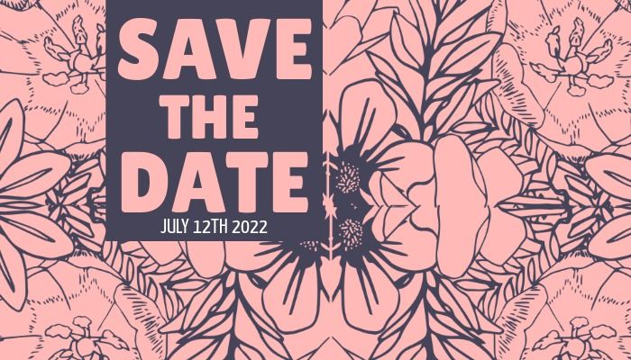
The second design shows a more muted pink. Even though pastel pink is never overly bright, it can still vary in shade. A save the date design is well-suited for this color scheme.
Pastel Blue
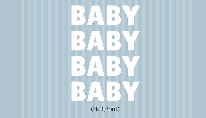
Like pastel pink, pastel blue can be a good choice for baby shower designs and new baby announcements
It represents the innocence and purity of a newborn baby boy and can be used in birthday cards or invitations too.

Creating personal or professional designs
Pastel is also very suited to creating designs for professional use. Blue is a color of trust and professionalism, so it can be used in business-related projects.
In this business design, pastel blue radiates a sense of assuredness and backs up the image of a handshake, a sign of agreement, trust and gratitude.
Pastel Purple
Pastel purple is a calm, stable color that is good for designs that celebrate an achievement or mark a milestone.
It’s also a feminine color that can work as an alternative to pastel pink. Some of the other names for pastel purple are lilac and mauve.

A sense of achievement
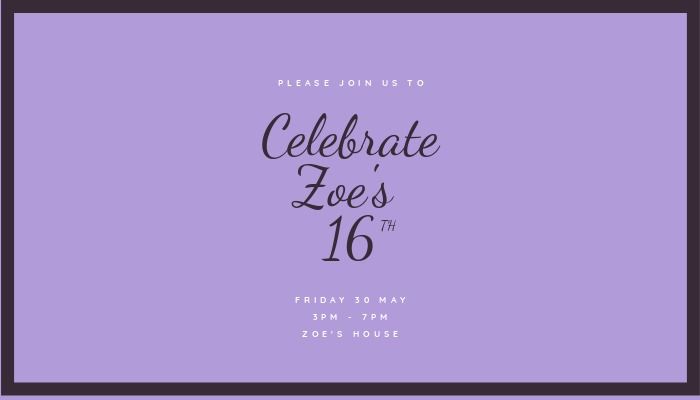
Here we see purple used effectively in designs for a 16th birthday and a congratulations message for a sports team.
Purple is often associated with victory and wealth, so it is a good choice if you want to make the recipient of your card feel on top of the world.

Pastel Yellow
Yellow is regularly associated with optimism and fun. It often shines out of designs, but it can also appear in more mellow tones.
Here we see pastel yellow utilised in an Easter design. Easter and pastel colors go hand in hand, with the yellow hue of this template conveying the excitement of the occasion.

Laid back tones
In this design for congratulating someone on their new home, a laid back yellow is mixed with a strong red to create an interesting contrast.
It shows that, while pastel colors look great when matched up together, they can also look good when combined with colors that are very different.

Pastel Orange
Embrace the comforting glow of a summery pastel orange in your designs and make them more engaging at the same time.
The effect of this shade of orange can be seen in this summer sale template, where it contrasts with blue and pops nicely.

The positivity of orange
Orange has positive, uplifting connotations and that makes it great for thank you cards, party invitations and birthday cards.
Peach is also a shade of pastel orange. It’s a neutral color that is extremely flexible and can be used as a background for a wide variety of designs.
Pastel Green
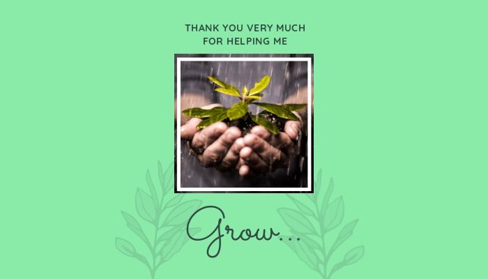
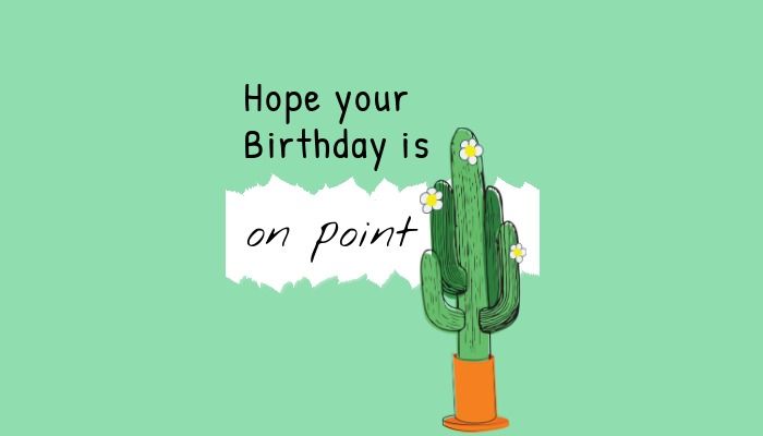
Green of any kind is synonymous with nature and pastel green is no different. In a design, it often feels tranquil and gives us an appreciation of the world around us.
It symbolises growth and renewal, making it ideal for a design that centres around progression in life.
Soothing nature vibes
Give your family or friend a card with a design that uplifts them and highlights the soothing properties of nature.
If you’re a business launching a new eco-friendly product or service, use pastel green to highlight your environmentally conscious approach.
Conclusion
Pastel colors look set to continue to feature in design trends for many years to come. Bright colors can sometimes appear to garish or tacky, whereas pastel colors are nearly always appropriate.
Take these color tips on board and start creating your own design with a pastel background.
When you’ve finished making your design on Design Wizard, show it off by tweeting @getdesignwizard.

Michael Cole
Michael Cole is a professional content writer. He has completed a BA in English and History and an MA in Journalism. Michael has extensive experience writing for both print and web and can turn his hand to any subject. His favourite one is free graphic design software. Especially he likes Background Remover by Design Wizard.


