How Big Is A Youtube Thumbnail?
If you’re asking what the ideas YouTube thumbnail size is, you’re probably scanning the web wondering, “How can I increase my Youtube views and subscribers?” Most likely you’ve come to understand that Youtube thumbnails can work magic on increasing your video clicks, engagement, and, ultimately, subscribers.
Table of contents:
- ● How Big Is A Youtube Thumbnail?
- ● Youtube Thumbnail Size
- ● Creating a Clickable Youtube Thumbnail For Your Video
- ● Importance of Youtube Thumbnail Dimensions
- ● The Aspect Ratio: What to Consider for thumbnail size
- ● YouTube Thumbnail Size & Dimensions
- ● What is the Maximum File Size for your thumbnail?
- ● Youtube thumbnail resolution
- ● What is the Best Image Format for Your YouTube Thumbnails?
- ● Custom Thumbnails
- ● Ideas for Your YouTube thumbnail image
- ● The Perfect YouTube Thumbnail
- ● YouTube Thumbnails Need to Be Visually Stunning
- ● Something to keep in mind: Use a face as your image
- ● Consider Adding Text to the YouTube Thumbnail
- ● What font should you use for the text of your YouTube thumbnail?
- ● Think About the Color Scheme and Your YouTube Channel
- ● YouTube Thumbnail images can get creative.
- ● Go for a Branded Template for YouTube Thumbnail
- ● Be Honest with Your YouTube Thumbnail
- ● Think of the custom thumbnail as a teaser for your video content.
- ● Test That YouTube Thumbnail Out
- ● Get feedback on your thumbnail first.
- ● Check Out the Thumbnail Competition
- ● Stay Away From the Lower Right Hand Corner of Your Thumbnail
- ● Center thumbnail content as much as possible.
- ● Create a Thumbnail easily
Youtube Thumbnail Size
So, what is the ideal YouTube thumbnail size? While the thumbnail dimensions and thumbnail size may seem straightforward, there are other things to consider when aiming to create the ideal-sized YouTube thumbnail design.
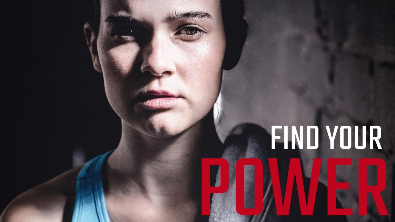
The ideal Youtube thumbnail size is 1280 x 720 pixels. When you are creating your custom Youtube thumbnail, these dimensions will make your thumbnail perfect for your youtube video. But there is a lot more to creating the perfect youtube thumbnail other than getting the size right.
Creating a Clickable Youtube Thumbnail For Your Video
Getting your YouTube thumbnail size on-point is important when it comes to receiving both clicks and views from the sidebar, and if you are lucky, the Google search results. For this reason, having an attractive-looking, and correctly sized video thumbnail to accompany an interesting video title is important.
Importance of Youtube Thumbnail Dimensions
YouTube pulls in nearly two billion users per month. That is two billion sets of eyes out there for the taking or rather, to attract to your video. How do you do that though? How do you get those users interested in your video enough so that they click on it? It all starts with the thumbnail image. Just like when people are looking to purchase a book, they are going to judge said book, at least in part, by its cover. There really is no difference here. Your thumbnail needs to be attention-grabbing. That’s why it is best practice to have a custom thumbnail image over just a still image from your YouTube Video, and ensure it is of the correct YouTube thumbnail size. If the YouTube thumbnail dimensions are off, it can cut the image off.
Which brings us to the question: How big is a YouTube thumbnail? And what is the right YouTube thumbnail size and dimensions?

Size does matter—when it comes to YouTube thumbnail size anyway. Ensuring the dimensions are where they need to be, and consequently, the pixels on point is going to help your YouTube thumbnail put its best foot forward in the hopes of ultimately being opened.
Of course, it’s not solely about the size. There are numerous elements that go into creating that optimal thumbnail such that you can use to promote your YouTube channel, your business, your cause, you name it. In this article, we will touch not only the perfect YouTube thumbnail size, but we will go beyond just the dimensions. We will also look at a few of the key components you should be aware of when it comes to developing a killer YouTube thumbnail.
The Aspect Ratio: What to Consider for thumbnail size
Aspect ratio isn’t necessarily something you have to be overly worried about if you stick with that 1280 x 720 size. This is because if the image size is 1280 x 720 then it already has an aspect ratio of 16:9 the ideal ratio for which you are aiming. 16:9 (the ratio between image width and height) fills the entire box perfectly, and so you preclude the need for black bars in the thumbnail which only make it less attractive and less professional looking.
YouTube Thumbnail Size & Dimensions
YouTube recommends a minimum width of 640 pixels wide. If you note, those submitted images that are smaller tend to be quite fuzzy and blurry overall. Again, this is why the ideal YouTube thumbnail size falls in that sweet spot of 1280 x 720.
What is the Maximum File Size for your thumbnail?
YouTube indicates that the maximum file size that you can upload as far as thumbnail images is 2MB. If you do try and use anything larger than this for your video thumbnail, the file will be rejected. So ensure you have the correct image file size by sticking below 2MG.
Youtube thumbnail resolution
Try to aim for a resolution of 1280×720 (with a minimum width of 640 pixels).
What is the Best Image Format for Your YouTube Thumbnails?
Once you know your YouTube thumbnail is under 2MBs, make sure you use a correct image formate for your thumbnail. These can by .JPEG, .GIF, BMP, or PNG.
Custom Thumbnails
Having custom thumbnails is a great way to increase clicks on your YouTube videos. Once you have figured out the best YouTube thumbnail size and dimensions, it’s time to get creative. Start thinking about what the best way of summing up your video would be if you had to put it into a picture. How can you entice the viewer to click on it and make them want to watch your YouTube video?
Ideas for Your YouTube thumbnail image
You may not opt for an image that is actually in your video. You may find it better to add a stock image or one of your own images as the main picture in the thumbnail. This is a great opportunity to choose something that stands out from the crowd. A good idea is to use the YouTube search bar to search the term that would be/ will be associated with your video. Once you hit enter, look at the results, but more importantly, look at the thumbnails they use as preview images and observe the sidebar images. Think about what image might stand out from the crowd, the use it.

Now that we’ve looked into the size question, let’s look a bit more closely at how to get that perfect YouTube thumbnail. Remember, this is your first impression, this is that which gives the user a glimpse at what they can expect from your content. Also, you might want to keep in mind that thumbnail branding—or creating a consistent look and feel across all relevant thumbnails so that viewers instantly recognize it as your content—for many has meant the difference between lackluster performance and a huge boost in subscribers.
How do you go about making those thumbnails pop and thus getting more clicks…
The Perfect YouTube Thumbnail
Now that we’ve looked into the thumbnail size question, let’s look a bit more closely at how to get that perfect YouTube thumbnail. Remember, this is your first impression, this is that which gives the user a glimpse at what they can expect from your content. Also, you might want to keep in mind that YouTube thumbnail branding or creating a consistent look and feel across all relevant thumbnails so that viewers instantly recognize it as your content for many has meant the difference between lackluster performance and a huge boost in subscribers.
YouTube Thumbnails Need to Be Visually Stunning
We’ve already established what size your YouTube thumbnail needs to be in order for the image to maintain high quality and sharpness regardless of channel. The image itself is also incredibly important here. People are naturally drawn to exciting and interesting visuals. If your YouTube thumbnail suggests the same-old same-old, if it is merely meh, then chances are pretty good they will scroll on by.
And make sure that when choosing your YouTube thumbnail image, you make it meaningful. In other words, the picture should represent what your video is all about. People are basing their decision on this still frame teaser; if they consequently select your thumbnail and meet with a video that has no relevance to the image, they are only going to be disappointed and may refrain from choosing your videos in the future. And don’t forget to follow the YouTube Community guidelines when choosing your images.

Something to keep in mind: Use a face as your image
Why a face? Simply put, it makes the YouTube thumbnail more personable. You create this virtual connection with users, especially if the image used is intensely expressive. People love to see what evokes emotion in others they can’t help themselves.
Consider Adding Text to the YouTube Thumbnail
Besides adding text to your video, adding text to your thumbnail is a great way to say something about the content contained therein. Plus, if done powerfully, it adds more dimension to this relatively small space you have in which to get people’s attention. This tells people more about what they can expect and could even offer a specific hint or teaser regarding your video.
Not to mention, let’s say you’re uploading a series of related videos. Having titles on these lends itself to the sequential nature of a YouTube series. And again, this could also go a long way toward branding those videos. Text tends to create a uniform look and thereby helps to establish more of a branded identity.
Like images, ensure you follow the community guidelines when adding your text.

What font should you use for the text of your YouTube thumbnail?
The font is pretty important here. Too frilly or intricate and given the size of most thumbnails, it is just going to make it difficult to read. You ideally want something crisp, clean, and also bold. It needs to be big enough to get noticed but not too complicated or overwhelming so as to take away from the thumbnail image.
Think About the Color Scheme and Your YouTube Channel
Again, thumbnails are a visual experience, as such, you need to consider all aspects and design elements of what makes a compelling visual display. Color of course is at the top of the list. The great thing about the design/graphic programs and software available is that you can use them to alter the color of any image. Brighter, bolder colors stand out, plain and simple. Contrasting colors can work very well if done correctly. Muted tones tend to blend into the background or in this case, into a sea of thousands of similar YouTube thumbnails.
Color also, as has been noted, can add to the branding aspect of your YouTube thumbnail collection. If especially, you have an established business for example, with colors that tend to be regularly associated with your brand, try and use these as far as your YouTube presence. It’s about getting people to associate those thumbnails with your brand on sight.

YouTube Thumbnail images can get creative.
Don’t be afraid to think outside of the color box on this one. Lately, we are seeing more and more color combinations that would otherwise be considered discordant. And yet, when blended together in certain thumbnails they really do pop. Having contrasting colors can do just that.
Go for a Branded Template for YouTube Thumbnail
It’s certainly something to try and add a sense of consistency throughout your custom thumbnails, you can take it a step further even and create a go-to thumbnail template that you use for all of the relevant videos in a given series. This also makes it easier on you incidentally as you’re not having to come up with a new customized thumbnail design each and every time.
You could use a more uniform background and then set your photo with a title against it. This is a pretty popular move for many YouTubers. Or you may not even opt to use an image. Depending on how identifiable as far as your brand, it may be a matter of just keeping things simple for your thumbnail template.
You might want to alternate and colors in a thumbnail template.
Many people/companies actually keep the same design/font/style and differentiate one video from another by switching up the background color. This could make for a visually interesting effect when your thumbnails all come up together.
Be Honest with Your YouTube Thumbnail

That is to say, clickbait is only going to anger people when they eventually get to your video and realize it has no relation to the thumbnail on which they clicked. Sadly, clickbait is pretty pervasive on the platform across many such platforms. All it does is to erode users’ trust, and that is consequently why many are becoming highly skeptical of content in general.
This is all the more reason why you need to make sure that your custom thumbnail is a fair and accurate representation of what a potential viewer can expect from your video. Plus, consider the fact that if your bounce rates start going through the roof because users are disgruntled once they get to your video, YouTube can actually suspend your usage.
Think of the custom thumbnail as a teaser for your video content.
Teasers can be fun, they can be exciting, and most of all they often compel people to want to check out your content. So rather than try and oversell – or worse – lie about what your video is about, create an engaging and attention-grabbing teaser still image for your thumbnail.
Test That YouTube Thumbnail Out
This is key. If your thumbnail is not getting you any traction, if very few people are clicking on it, then it is probably time to go back to the YouTube thumbnail drawing board as they say. Testing is relevant with anything you do as far as online marketing and/or more specifically as is the case here, YouTube marketing

You can do an A/B test with your thumbnail image. Run them both, see which performs better, see which people tend to click on and which one gets largely ignored. After running this test, you will have a much clearer picture as far as any adjustments you might need to make to the more popular thumbnail. And that’s the other thing, don’t be afraid to change it up. Yes, you may have put a lot of thought and energy into creating your YouTube thumbnail, but that doesn’t mean it can’t be made better. You want to strive to make it the best that it can possibly be.
Get feedback on your thumbnail first.
Before even launching that thumbnail into the world, you may want to get some good old-fashioned feedback from colleagues and friends for example. The testing itself is a sort of feedback but simply asking peoples’ opinions can help you gauge its potential for success.
Check Out the Thumbnail Competition

Odds are, regardless of what type of YouTube content you’re creating, there is someone out there with a competing platform/channel. Take some time to see what they are doing as far as developing thumbnails for their content. You could actually learn a lot in terms of what might be working for them, what people are gravitating toward, and how theirs might have outdone yours in some way.
Especially if your competitor has a similar audience, the information you garner from studying their thumbnails could be extremely helpful in crafting more effective and targeted ones for yourself.
That said, you don’t want to outright copy their image.
You of course want to stay true to your brand and your message. Even if thumbnails seem to be working quite well for the competition doesn’t mean yours should mimic theirs. Pay attention to the individual elements that may be working and still keep your uniqueness at the same time.
Stay Away From the Lower Right Hand Corner of Your Thumbnail

This is space that generally gets covered by a YouTube timestamp or some sort of button. So, if you do put something in that space, odds are it will be difficult for people to see it. Also, keep in mind that in many countries people tend to instinctively “read” things from left to right. That lower right-hand corner will be the last place their eyes shift to.
Center thumbnail content as much as possible.
You really can’t go wrong by putting the most valuable elements of your thumbnail front and center. This is the first thing that will come into a user’s line of sight and consequently, that compelling first impression will definitely be made.

Many might wonder why thumbnails are so important as far as videos are concerned…Hopefully you can see that the thumbnail is basically considered your content’s calling card. It gives users a hint of what is to come, and if it does its job correctly, it makes them want to click on it and thus segue to your video.
Create a Thumbnail easily
You don’t need to know graphic design and you don’t have to spend a ton of money or time either on creating the perfect YouTube thumbnail. Just pay attention to the details: how big is a YouTube thumbnail, what colors should you use, should you include any titles or text, does it essentially connect with prospective viewers. These are all questions you most definitely want to address upon creating your next YouTube thumbnail that is, if you want to ensure that it actually gets you the results you desire. To create your own YouTube thumbnail now, check out our selection of thumbnail templates here! Use our design tool to make it your very own. If you need to download that perfect thumbnail at the end of it all, that’s easy too. Simply hit the download button on the dashboard.

anne carson
Anne is a former English professor turned content writer. Holding a PhD in Literature, she spent almost a decade in academia putting that degree to use, until finally realizing it wasn't exactly the best fit. A full-time writer, she's learned a great deal about the numerous subjects. She knows a lot about design trends and design templates. A mom of five (two teenagers and three dogs).


